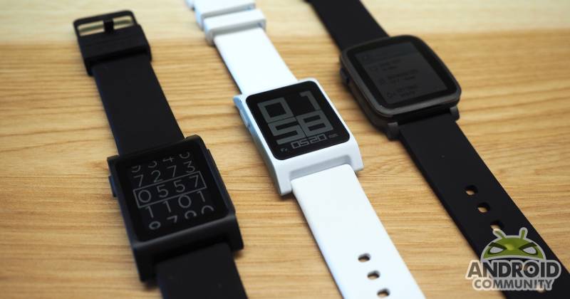
Companies would love customers to keep using their products, especially if prolonged usage actually translates to more profits, like spending more time on a website or watching a video. Pebble, ever the contrarian, is going off in the opposite direction. It actually wants you to spend less time on your smartwatch. Ridiculous as that may sound, it follows the adage that the best interface is an invisible one, leaving users more time to do what they really need to do, which in most cases should be living life to the fullest. That is why Pebble is introducing a new “Actions” concept, which it will be shipping with the new Pebble 2 and Pebble Time 2 smartwatches.
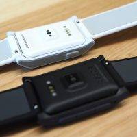
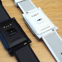
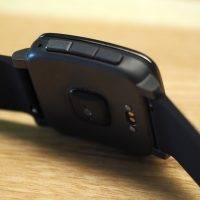
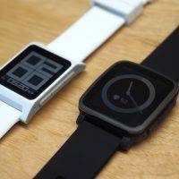
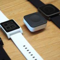
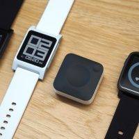
The original Pebble is long overdue an upgrade but for some, the Pebble Time line went a bit too far with its colored e-paper screen and relatively shorter battery life. That’s why with the Pebble 2, the company stuck to the monochrome e-paper display that still has a strong following. At the same time, however, it crammed the guts of the first Pebble Time inside upgrading the hardware and opening up new possibilities. That includes the mic for sending voice replies as well as a new heart rate monitor at the back. Despite the changes, the Pebble 2 is still compatible with 22 mm straps just like the first one. Available in five colors, the Pebble 2 goes for $99 and starts shipping in September.
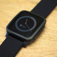
In comparison, the upgrade for the Pebble Time 2 is less drastic. The biggest points include the display, which is now 50% larger and has 80% more pixels, while still remaining the same colored e-paper screen. There is also a heart rate monitor now as well. It has also switched to using Bluetooth LE to extend battery life to 10 days, one of the biggest complaints with the original Pebble Time. Sadly, that also means it will be snubbing older smartphones that don’t support the latest Bluetooth 4.0 spec. Going for $169, the Pebble Time will be available with black, gold, or silver stainless steel casing, and will ship much later in November.
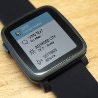
As exciting as the hardware upgrades might be, it’s the software that will really call attention to this new generation of smartwatches. While the launch of the original Pebble Time marked the launch of the new Timeline interface, the launch of the Pebble 2 and Pebble Time 2 will also mark the launch of Actions. Perhaps Pebble should have called them Quick Actions to describe the feature better, but that would be two words instead of one. But in a nutshell, Actions let you do something with as few as two pushes of a button.
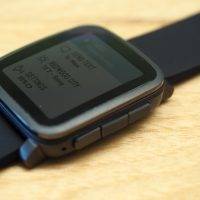
Pushing the top button on the right side of the Pebble launches the Action screen, which lists, well, actions. They are primarily single target functions attached to a Pebble app. For example, it will let you send a message to a single, pre-defined contact, which Pebble CEO Eric Migicovsky claims is what most users do most of the time anyway, or call Uber from your current location. In the future, the contents and order of the list could depend on your location, time of day and other context. For now, however, it’s a flat list.
The goal of actions, which will surely be the highlight of Pebble’s smartwatches, is to let you do an action and get out of the way as quick as possible, no fuss, no distractions. The very essence of smartwatches. At least for one camp of smartwatch believers. The other camp believes in almost practically replacing a smartphone. Which camp wins in the end is still uncertain. For now, the market is both young and wide open for both to grow and evolve.
The Pebble 2 and Pebble Time 2 are available on pre-order from Pebble’s Kickstarter page.





that pebble time 2 surely look like a pre-production unit, still look great! i need one 🙁
Smart Watch? COOL!!!