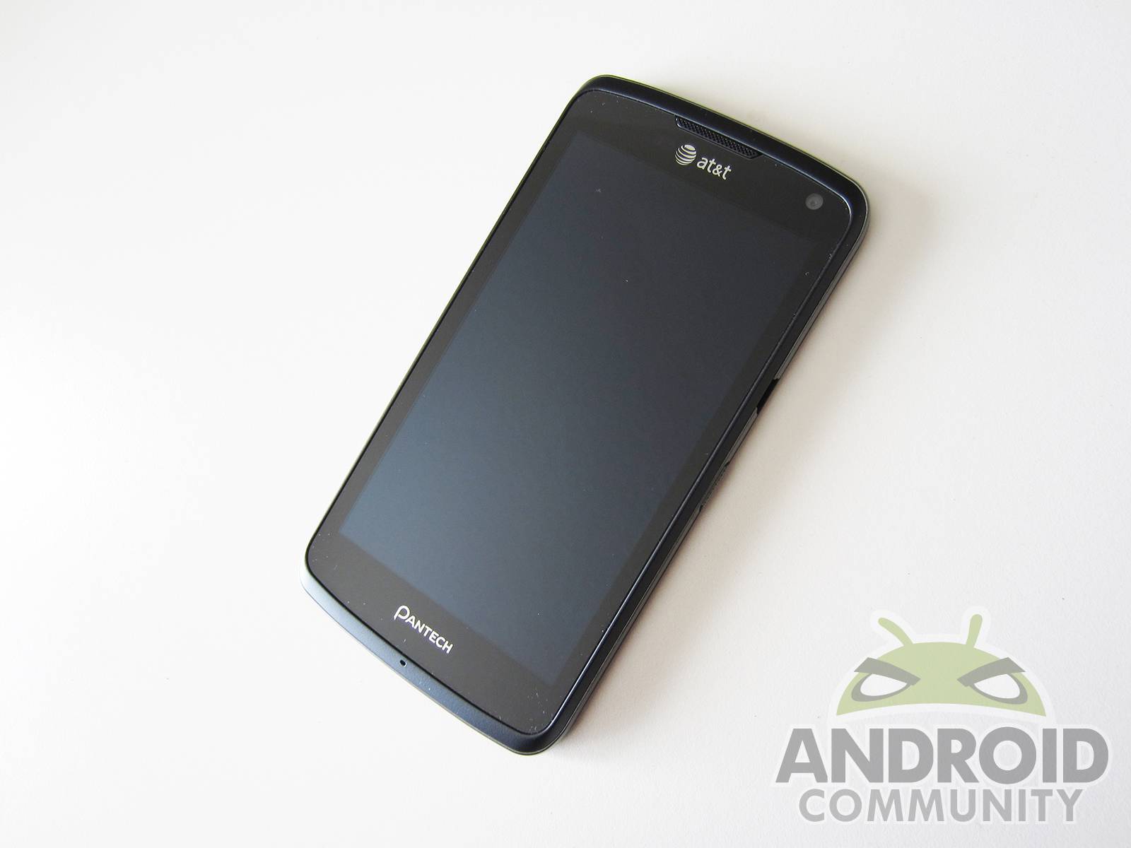
While Pantech has never been a major leader in the Android handset business, they’ve been a relatively good choice when it comes to budget devices. The company’s newest smartphone, the Flex, is Pantech’s first attempt at making a real contender while still keeping the price on the down-low. It’s available now on AT&T’s network for just $20 after signing a two-year contract. It has a Qualcomm Snapdragon S4 chip, Android 4.0 Ice Cream Sandwich, and a large 4.3-inch display — all of which are crucial ingredients to a powerhouse device. However, since specs aren’t everything, we have to dig deeper into the Pantech Flex to see if it can compete with the likes of HTC, Nokia, or even Samsung. Let’s see how it fares.
Hardware
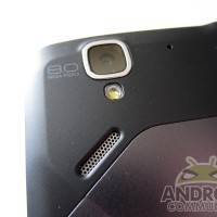
The Flex packs in a Qualcomm Snapdragon S4 SoC (MSM8960) that combines a 1.5GHz dual-core Krait processor with Adreno 225 graphics. It’s the same exact CPU/GPU combo that’s in Samsung’s flagship Galaxy S III, as well as Nokia’s Lumia 920, both of which are some of the best devices on the market currently. The Flex also has 1GB of RAM and 8GB of internal storage (expandable storage available via a microSD slot). There’s also an 8MP camera on the back capable of shooting 1080p video, paired with a 2MP VGA front-facing shooter. Other amenities include 4G LTE and HSPA+ support, 802.11a/b/g/n WiFi, and Bluetooth 4.0 — all powered by a 1,830mAh battery.
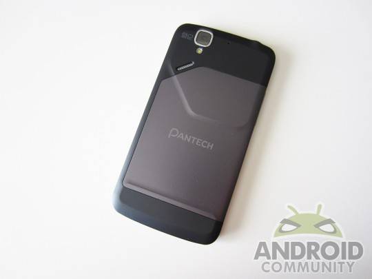
The Flex’s 4.3-inch Super AMOLED qHD display offers great touch response and good viewing angles. However, it features a PenTile matrix, which causes text and smaller icons to appear slightly blurry, but like most Super AMOLED displays, the Flex’s screen features deep blacks and great color saturation, just don’t expect it to be a really sharp and crisp display.
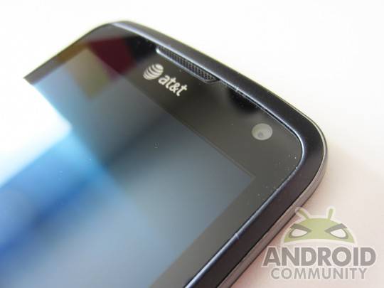
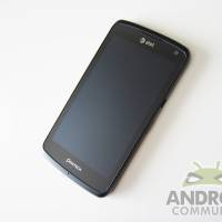
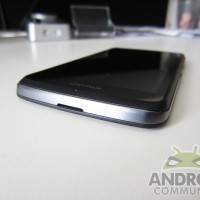
As far as the design of the phone, it’s really thin — almost exactly a third of an inch thick, which is right up there with the Galaxy S III and the LG Optimus G. It’s not really a sleek-looking device, though. The back has weird indentations and part of the battery cover is a lighter shade of grey than the rest, which doesn’t make much sense, considering that it doesn’t serve a function from what I’ve noticed. It covers the same area as the battery, but I’m not really sure what benefit this provides.
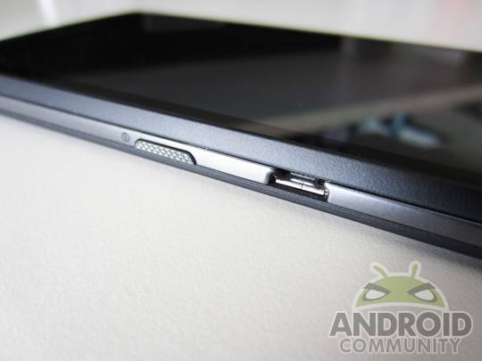
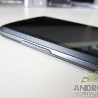
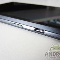
To make matters worse, the power button and the microUSB port are in the worst places possible. The power button is on the right side smack dab in the middle, while the microUSB port is a little bit further up. Honestly, the location of the microUSB port is actually where the power button should be, since casually holding the device will have right-handers covering up the port with their thumb. Overall, I think Pantech took a big swing and a miss with the design of the Flex. However, despite it’s mostly plastic build, it feels really solid in the hand and provides enough weight that it won’t feel like you’re just holding a piece of plastic.
Software
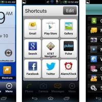
The Flex runs Android 4.0 Ice Cream Sandwich with Pantech’s own unique twist to the UI. One thing that’s really unique about the handset is that it has two user interface modes. The first one is obviously the traditional Android UI, and the second mode is what Pantech calls “Easy Experience.” It essentially offers an extremely user-friendly interface for those who aren’t too familiar with the inner workings of a smartphone operating system. The Easy Experience simply gives you one home screen that offers quick access to everything a handset user would need access to, such as the dialer, camera, contacts, web browser, and text messaging. There’s one main widget that displays the time, date, and weather, all of which launch the alarm clock, calendar, and weather apps, respectively, when tapped on.
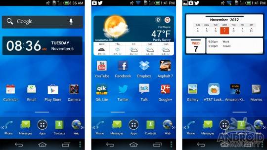
The Easy Experience home screen also has a quick contacts list, which offers access to voicemail and up to five frequent contacts, as well as a shortcut button that displays your most frequently used apps. Everything is labeled well and text appears larger than the traditional UI to make it easier on the eyes, especially for elderly folks. It’s extremely simple and minimalistic, but you’ll have to keep in mind that there’s no customization options available in Easy Experience mode, which means you can’t change around icons, add widgets, nothing. It may seem restricting, but I actually really like it. Sometimes users can get overwhelmed with the traditional UI — even experienced users — so it’s nice that the phone gives you the option to go back to simpler times.
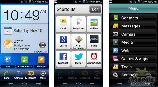
Of course, you can always use the traditional Android user experience and get all the features and customization options that you need. However, Pantech’s all-out Android UI is fairly cluttered and has a slightly cheap look to it. They tried to make everything as easy and quick as possible to get to, and while that sounds great on paper, it doesn’t work well on a mobile OS. However, one thing that’s pretty neat is the ability to add up to 10 frequently-used apps as a shortcut to the app tray at the bottom, and then you can scroll either left or right to access them. The keyboard comes with SwiftKey built-in and enabled by default, which is a nice convenience to have, but if you prefer the stock Ice Cream Sandwich keyboard or even Swype, the Flex comes with both of those options as well, right out of the box.
Overall, Pantech’s Easy Experience UI feature is the biggest selling point for the software on the Flex by far. Even though it’s meant for those who aren’t too familiar with a smartphone and don’t want to be overwhelmed, I particularly like it alot and I could easily see myself using the Easy Experience UI on a day-to-day basis — it’s simple, clean, and minimalistic.
Camera
While the camera has a respectable 8MP sensor, the Flex proves that megapixels aren’t everything. Photos aren’t that great of quality, and it seems to have trouble focusing while taking macro shots. Outdoor shots are fairly clear, though, and with enough adequate lighting, you can take a pretty good picture. However, there aren’t a lot of settings. You can change the exposure and white balance presets, but there are no ISO settings, and under “Effects” was really only one effect. To make matters worse, the camera app takes a little bit of time to load up, especially from the lock screen. It felt like it would hang for a little bit before I could actually start aiming and snap a photo. And after tapping the shutter button, it took a second or two for the camera to actually snap an image. This is a huge drag, especially for those that need to take a photo of fast-paced action.
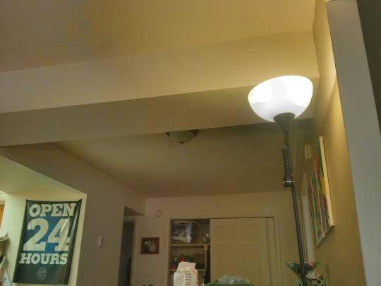
Meanwhile, shooting 1080p video with the Flex’s camera is smooth and fluid, but it suffers from the same weaknesses as the still image camera. However, HDR mode performs quite well, but still suffers some quality issues. In the sample photo above, I pointed the camera towards a lamp fixture, and it easily captured the light intensity of the lamp, as well as the darker background without any problems, but mysterious blotches appeared, and you can definitely see where the camera stitched the photos together, especially on the light fixture. Obviously, if you care about quality, you probably won’t be relying on the Flex’s camera at all, but it proves as a worthy backup in case you ever forget to bring your main shooter with you when you go out of the house. It certainly won’t take photos that’ll win you a Pulitzer Prize in Photography, but it takes decent snapshots in a pinch, and can prove useful when you need a camera the most.
Benchmarks & Battery
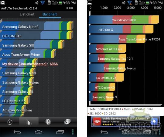
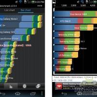
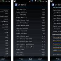
The Flex’s benchmarks scores were really impressive, and that’s obviously due to Qualcomm’s Snapdragon S4 dual-core CPU under the hood that’s clocked at 1.5GHz. In Quadrant, the Flex scored just over 5,000, barely beating the HTC One X but absolutely crushing the Samsung Galaxy Nexus. In AnTuTu, it scored almost a 7,000, tying with Samsung’s Galaxy Note and Galaxy Nexus, but not quite making it up there with newer handsets like the Galaxy S III and the HTC One X+.
The Flex runs as smooth as a baby’s bottom, and most apps open very quickly (the camera app not being one of them, however). I did notice that sliding through the different home screens was rather slow, but it wasn’t for the lack of smoothness from the animations and transitions, because they were still buttery smooth — it just seems that’s how the UI is built, where the time it takes to switch between screens is just a little slower than most other devices. However, it may only be a huge deal for those who need to quickly get to an app that’s on another home screen, but most apps we would need quickly are usually on the main screen anyway.
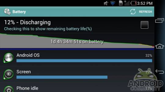
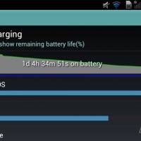
The battery is one aspect of the Flex that offers mediocre results. I noticed that playing games, surfing the web, and conducting benchmarks didn’t take a huge toll on the battery, but standby time is where the battery really suffers. Leaving the phone on overnight in sleep mode drained the battery by about 50%. Obviously, that’s a huge chunk of wasted battery life, so most users will want to turn the phone completely off before hitting the sack if they want an ample amount of juice left during the morning hours. But other than the hour or so of really heavy usage, I mostly just took time to surf all the different menus and browse through the different settings, and despite the huge drain overnight, the battery lasted just over 24 hours with moderate usage.
Wrap-Up
The Pantech Flex costs only $20 on contract, and it offers the same level of performance as a lot of current- and last-gen top-tier smartphones. Plus, the two different user experience modes are definitely a two-for-one deal, so the phone will cater to experts who know their way around gadgets, as well as novices who might be too intimidated to take on the full Android experience right away.
Of course, with any budget device, the Flex includes some features that Pantech definitely took some shortcuts on in order to keep the price low. The camera isn’t fantastic and the display isn’t as crisp and clear as it could be. Plus, the battery life reminded me of the days of the HTC DROID Incredible and even the ThunderBolt. While my experience with the Flex’s battery wasn’t exactly as bad as those days, I was surprised at how quickly it would drain by just sitting there.
However, getting a device like the Pantech Flex in exchange for only a crisp twenty-dollar bill isn’t anything to joke about, and the phone proves that Pantech is improving on their budget devices. While they may not yet be quite where most customers would want them to be as far as offering really solid budget devices, the Flex is another step forward for the company.
[device id=3411]




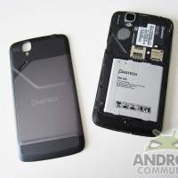







I assume the battery is removable right?
yes
AT&T has this on its 4GLTE network, and we have it here in Atlanta. I need the data speed for transmitting my large graphic design files, but not sure this is the phone for me.
This seems to be a phone for those who spend a lot of time outdoors. That would be me. I’m in Dallas (we have 4g LTE here, too, with AT&T; that’s what I use) and this phone would be great for me because I’m in real estate and I’m constantly moving around. I just hope the phone isn’t heavy.
So after many problems, I got a third phone but now it went load pictures properly how do I fix this
hello,
can u lock the screen while on video record mode???