Talk about the best vanilla Android experience paired to a great UI, and OnePlus rules the roost. There’s so much put into the tiny little details of designing the user interface that it bumps-up the brand’s value three folds. With the upcoming OxygenOS 11, things are no different, as there are elements in place that focus on daily usability. In a blog post on its forum, OnePlus detailed about the user interface tweaks coming with the OS for enhanced Android experience.
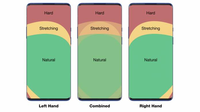
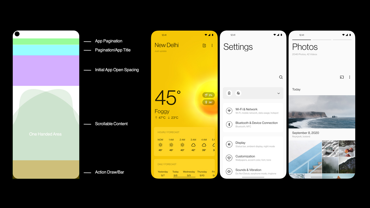
OxygenOS 11 will bring an optimized UI for one-handed use on the large OnePlus displays. With the anthropometric data from the users, they’ve designed a new user interface for easy usage. It’s natural to hold the phone from its bottom and reaching the top section of the screen can be difficult. So, they done some changes which solve this issue.
OnePlus has updated the layout to keep the touch controls close to the thumb(s) for easy access as soon as you open any menu. They’ve also added a quick share button in the Camera app for instant sharing of photos. Just long-press on the photo thumbnail in the Camera app and you can share the photo in a jiffy.

Another element that OnePlus has put thought is the size of the headline being displayed. In their A/B testing, it was found out that 65-percent of users want a smaller sized headline. One more finding revealed that 80-percent of users wanted to have subtitles along with the titles. This prompted OnePlus to design a headline-body hierarchy for streamlined visual information which enhances the end-user experience.
Along with these improvements, OnePlus is going to announce other changes as well in the coming days that will focus on daily usability and offer a seamless experience. They aptly expressed in their post, “It’s about providing a fast and smooth user experience where we’re adding as little as possible to the device.”


