The Opera browser for mobile devices is a favorite for people who like saving their battery and data and for those that aren’t pleased with Chrome, Firefox or their device’s default browser. And if you’re one of those people, then you’ll probably be happy to know that the app has undergone a design overhaul for the latest update, unless you’re one of those people that don’t like change with their apps and services. But since we’re probably used to apps doing refreshes on their design and features every once in a while, this is not unexpected and should be welcomed.
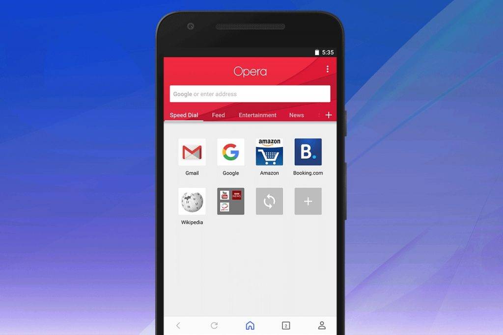
From the start page itself, Opera will look different once you’ve updated to the latest version. You will now see Speed Dial on the left and then your news feed on the right. The channels are at the top and all you have to do is scroll across the screen to see the others. And if there’s a topic you’d like to add, just click on the + button to customize the news that you will get in your feed. If you want the articles to load quickly, you can use the reader mode so it will remove the unnecessary images or extras that make it slow.

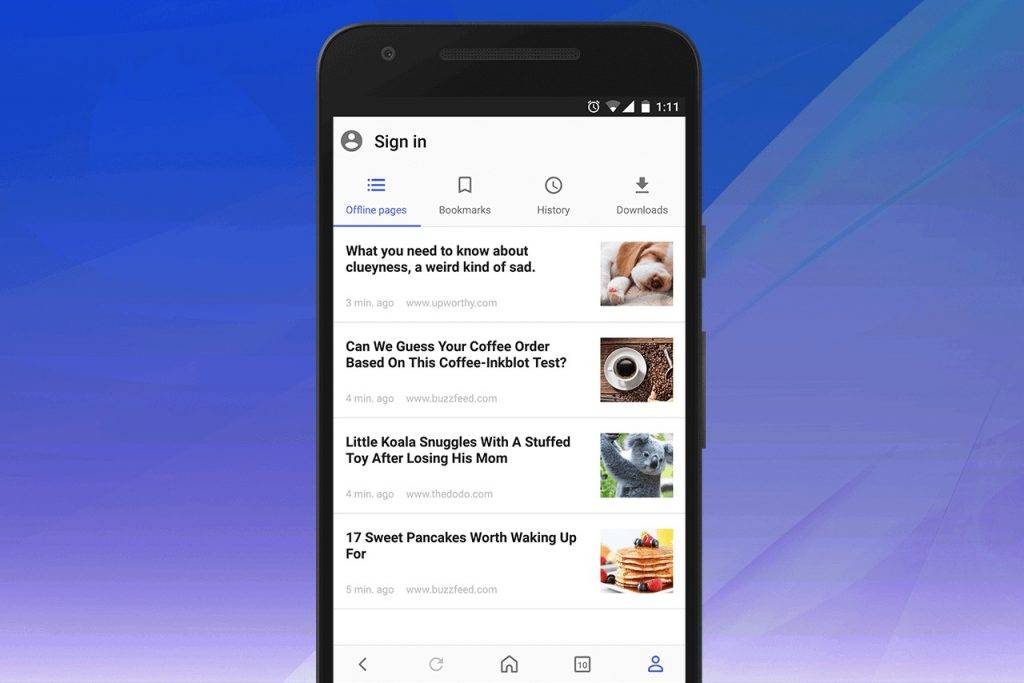
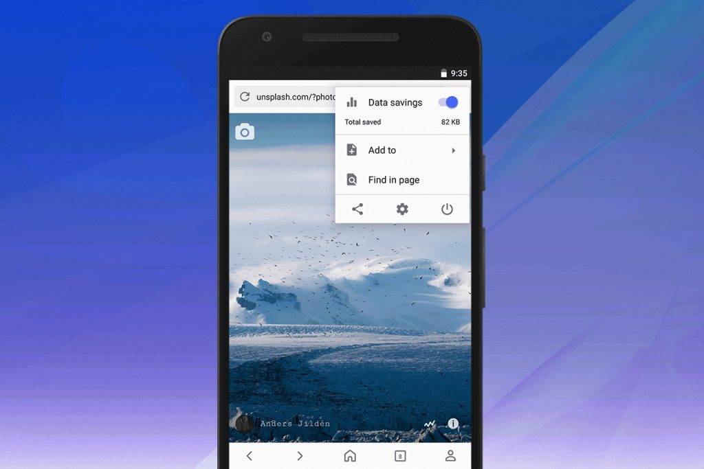
You will also now be able to see all your personalized things when you click on the person icon on the bottom right of your screen. It will show you all your bookmarks, offline pages, history, downloads, etc. And if you want to sync all these things, including your Speed Dial, bookmarks, tabs, typed history across devices, then of course you’d need to sign in to your Opera account. At the top right corner of the screen, the three dots there will bring you to the find in page and share functions of the browser. There is also an Add to button and the access to the browser settings.


The update is rolling out gradually so it may take some time for you to experience this new design. But you can always check the Google Play page to see if it’s available already.
SOURCE: Opera


