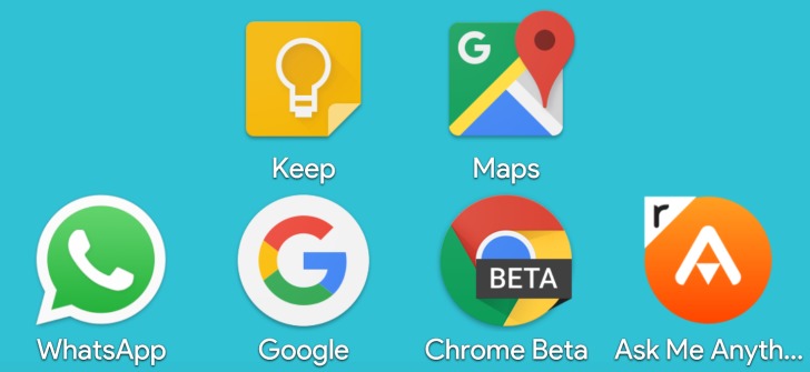
When talking about themers and launchers, Nova Launcher is one of the most recognizable names around. And they’re coming up with a feature that seems to be the solution to our problems with inconsistently-sized icons on our home screen. The “icon normalization” feature is being tested right now, but it’s one of those tweaks that just make your icons just more peaceful to look at.
Google has always given developers a bit of freedom when creating their app’s icons. And while we get a good amount of really nice icons, there’s this problem of the varying shape and sizes of icons. Material Design – Google’s chosen aesthetic structure coming introduced with Android Lollipop – actually has rules for squares and circles, which is where the developers of Nova Launcher got their idea of “normalizing” the size of icons.

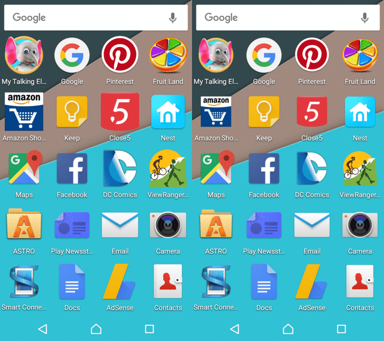
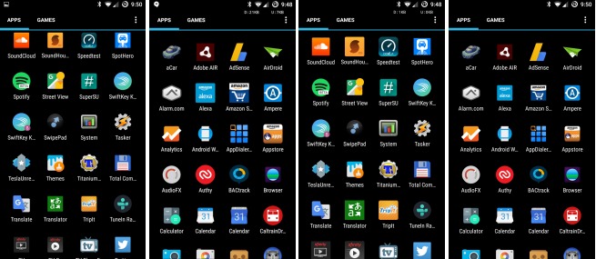
Nova Launcher’s new normalization feature can identify circles, squares, and portrait/landscape rectangles of any size, and then start to scale them to dimensions as regulated by Material Design rules. Pretty nifty, eh? And it’s not just about squares and circles too, as the feature’s algorithm will be able to evaluate unusual elements of an icon – protrusions and overlaps here and there – and keep the alignment based on the underlying shape. So you will have non-standard icons also scaling correctly. See the images below. The left two are not adjusted, the right two are adjusted by the normalization feature.

From what it looks like now, the feature is pretty impressive. It just lessens the eye fatigue when you see your app icons in line and orderly, right?
VIA: Android Police


