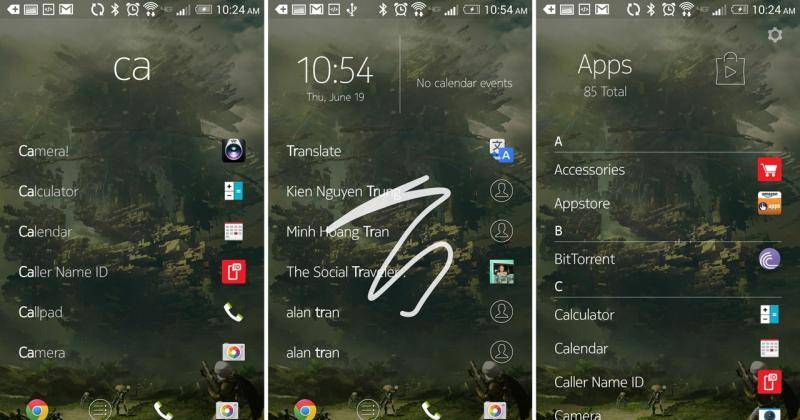
Nokia (yes, the real Nokia, or what’s left of it) is announcing an update to its still pre-beta Z Launcher homescreen replacement. Focusing on performance improvements under the hood, Z Launcher is taking a few steps closer to becoming a more serious contender in the Android launcher race.
Considering that the basic premise of Z Launcher is to get you to apps, contacts, and whatnot as quickly as possible, it is only natural that the launcher itself should be fast and responsive, a major improvement in this latest version of Nokia’s surprise app. That said, fast doesn’t need to mean ugly, so the dev team have sprinkled some new animations when transitioning to the home screen or to and from apps. The animations are noted to be still works in progress and the devs are asking for feedback on them.
There are also some functional improvements in the update, particularly regarding how contacts are displayed in the search results. Contacts that have multiple possible actions associated with them (like call and text) now appear collapsed in the list, so that a single contact won’t monopolize the screen space. The gesture portion of the launcher has also been adjusted so that you don’t accidentally launch an app when you draw a letter too quickly.
Z Launcher is a curious take on an Android launcher. It is search-centric like EverythingMe but unlike that launcher, it revolves around scribbling the letters instead of typing them, which, for some users, might feel easier or more natural. Z Launcher is still in a limited testing stage, so getting access to the app still requires applying for permission. Those who already have the launcher installed just need to go to the app’s settings to manually query the server for available updates.
SOURCE: Z Launcher


