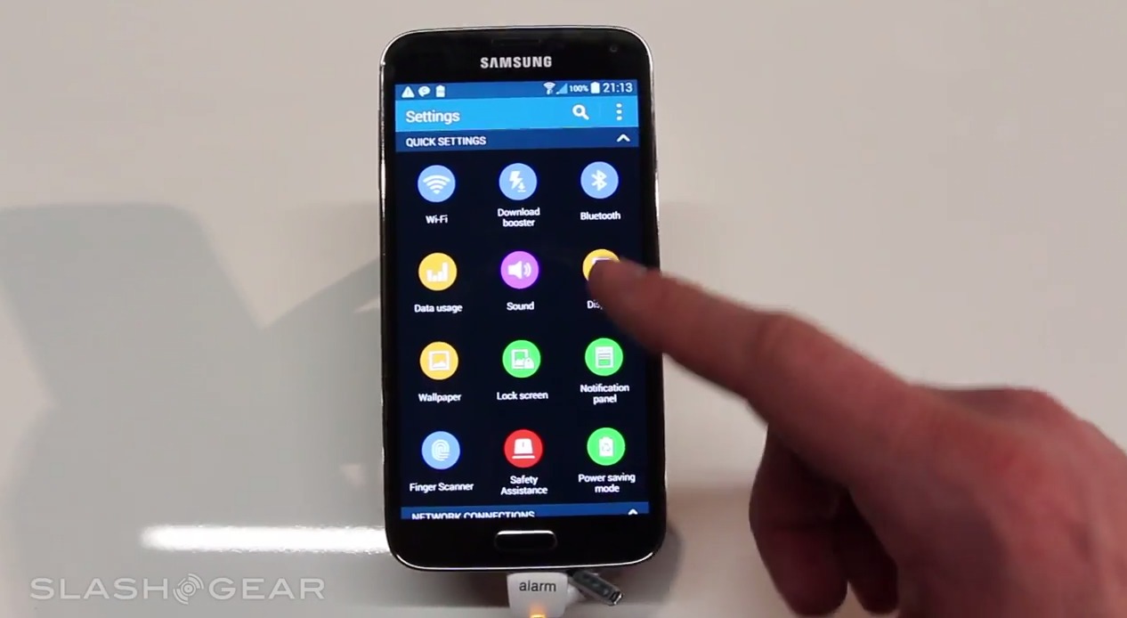
Samsung’s interface has changed with the Galaxy S5, bringing in a flatter appearance. The icons in the settings menu have been altered, and the look might be polarizing. While flat may be the new black when it comes to user interface, we’re not sure everyone is going to like Samsung’s take.
Via SlashGear, we see that Samsung’s new TouchWiz settings flair is, as we said, flatter. The icons are simple, clean, and easy to read. There colors pop, and the plain white outline of the utility it fronts is plain to see. From a point of being new, Samsung has done a good job in going a wholly new direction with their settings icons.
On the other hand, it’s all really simple. We don’t want to cheapen the experience, but some we’ve shown this to say the icons are almost child-like. They’re laid out effectively, though, falling into categories rather than a bulk list of icons. In some ways, it looks a bit too simple. In others, it could be considered subtly brilliant.
We’ve long felt TouchWiz needs an update, and we won’t say this one is necessarily bad. It will have it’s detractors, but everything does, right? We do like that Samsung took the liberty of changing the quick launch settings icons, too. We’ll see those a lot more than system settings, and we think it adds a nice little update for the Galaxy S5.


Samsung ui is pure womit
So, we’ve gone from an out of date looking hideous mess of a U.I., to an updated in some places, but only half finished, flat mess?! Well done Samsung, good job! The awful thing, that really bugs me is, to the average idiot Joe on the street, this is all they will see of Android because of Samsung’s immense marketing alone. It makes IOS7 look10 times better. I hate that because I hate CrApple even more than I despise Samsung. Other companies do much better job with Android as well as Stock & TouchWizz is an absolute abomination…period…