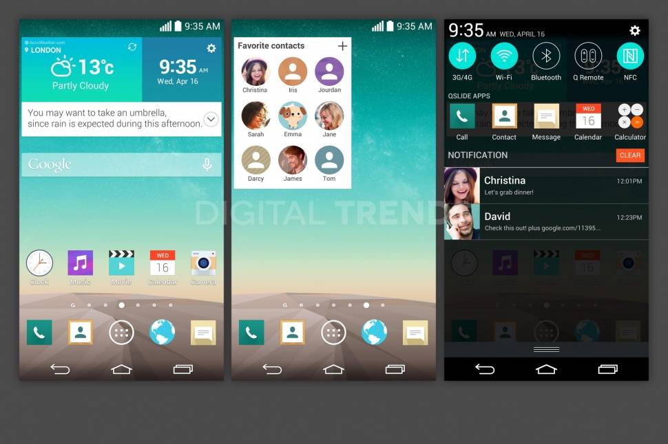
LG’s new flagship could bring a fresh interface as well. LG’s Android skin is fairly in-depth, and typically up-to-date with styling cues. Leaked shots, said to be from the LG G3, show a design that offers up flatter icons, rounded shapes, and a different color scheme.
The G3, expected to launch in the summer, is likely in the final stages of software tweaks. From top to bottom, i seems as though LG has reimagined their UI, and we must say — we like it. The natural comparison is to Samsung or Apple, and that’s fair, but those are both great as well. The icons are a touch smoother, and have a bigger color shceme than we’re used to. Rather than light up the actual shape of the service when in use, the entire icon now captures your eyes.
The icons in the settings menu are also flat and round, unlike the transparent background that’s been in use. LG has also redone their own apps, bringing in the flatter design in lieu of the skeumorphic icons that are going away altogether. The contact cons have also changed, again sticking with the rounded format.
There is no word on an official launch date for the G3, but we would expect to see this UI along with it. The real question remaining is whether or not LG will follow in the footsteps of Motorola and HTC, splitting their apps from the OS skin to allow for faster updates of older devices. Their software support comes slowly, and that’s a big reason why.
Source: Digital Trends


Much nicer than G2 UI which I hate but looks slightly better since kit Kat update
approx release date for carriers in US?