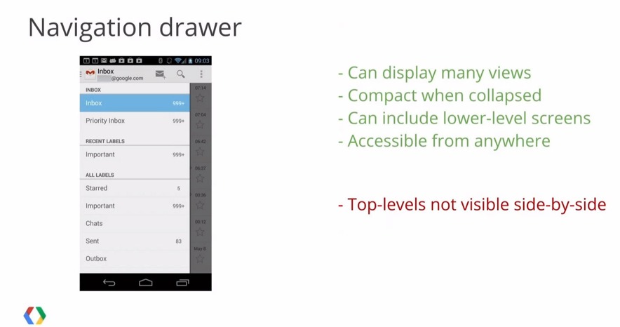
Today some news has surfaced about a potential redesign of Google’s Gmail for Android. What we’re seeing could be something new that is coming soon, or instead just a mockup that was used by Google. What you see below is a screenshot from a Google I/O developer session last week, and it’s a completely new Gmail with the slide-out navigation bar and all.
While talking about various things for all the developers, one session in particular called “Structure in Android App Design” featured a part about navigation. In that slide shown here we get a glimpse of the image above showing off a newly designed and improved Gmail for Android. At least that’s what many think.
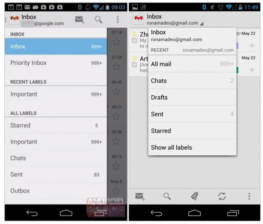
The details were revealed by Android Police, and apparently at about 23 minutes into the session is when the leaked image gets put up on screen. Now this could just be a mockup. After all it was in the middle of a 40 minute session where we saw tons of mockups and even slides of current looking apps like the Gallery in Android. Here’s the side by side with the new version to the left.

The slide-out navigation bar isn’t new for Android. Tons of apps use it already, like YouTube for example, and it was recently added to Google Music, Drive, and others. As it shows above the pop-up for all the options in Gmail has been replaced. Now a simple swipe from the left edge will slide-out this new navigation bar full of options. It also appears to show us that Google removed the action bar of icons from the bottom row as well. Oh and the stars and dates are a little bigger too.
This slide-out system isn’t new to Android and iOS Gmail has it, nor is it new to some of Google Apps. However, it would be a nice and welcomed change to the Gmail for Android if you ask us. This could just be a random mockup that was spotted, or the real deal. Hopefully if a major overhaul comes to Gmail it will be more than just this. Thoughts?
SOURCE: YouTube
VIA: Android Police


