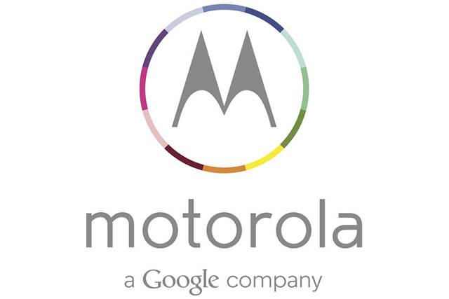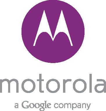
While we’ve yet to hear or see a confirmation from official channels, multiple sources and images have emerged this morning revealing the new logo and tagline for Motorola. With a new minimalistic design and lowercase M we have “motorola: a Google Company” being graced by a nice soft purple logo, as well as the multicolored one shown below.
Gone are the days of the bright red M and the bold MOTOROLA branding of old, and now we have a smooth, simple, and minimalistic design to go along with the new owners at Google. At least according to all reports flooding in this afternoon. Again while we mention it hasn’t been officially announced, they chose to use it for a recent advertisement for Techweek.
As shown at the bottom of the page, the Techweek conference in Chicago is being presented by Motorola, and that’s where the purple logo was revealed. However, we’re now getting another look from the folks at The Verge, who are claiming the new multicolored option is the real deal.

The new tagline “a Google Company” appears below the logo, and now we’re waiting for Motorola to announce it themselves. The lowercase design and minimalistic look fits right in with Google, just look at the logo for Google Glass, and everything else from Google as of late.
This comes right in time as the Google owned Motorola is soon going to announce their new American-made Moto X smartphone, and we can’t wait to learn more. Stay tuned.
What do you guys think of these new logos?


Great ! Can’t wait for Moto X !
why motorola wrapped off its business from india? I am firecly disappointed!!!
‘Merica
as Virginia implied I can’t believe that some people can make $9431 in 1 month on the internet. did you look at this site link www.KEP2.com