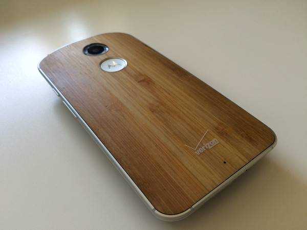
A natural upgrade to the 2013 version, the new Moto X definitely picks up where the former iteration left off. It’s a bit bigger, a touch bolder, and has a hint of class this time around — but does it do justice to the darling of the Android world, or try to hard? We find out in our review.
Design
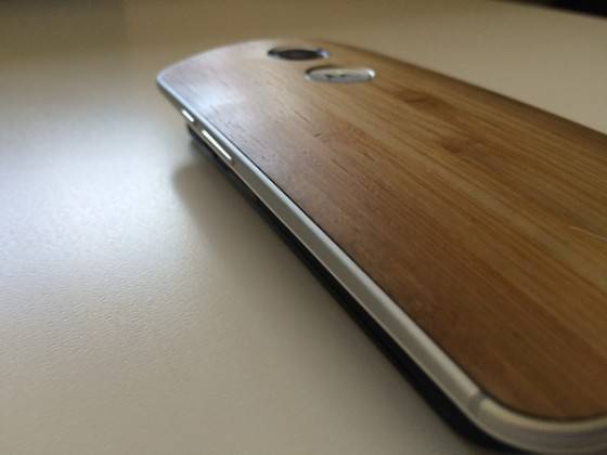
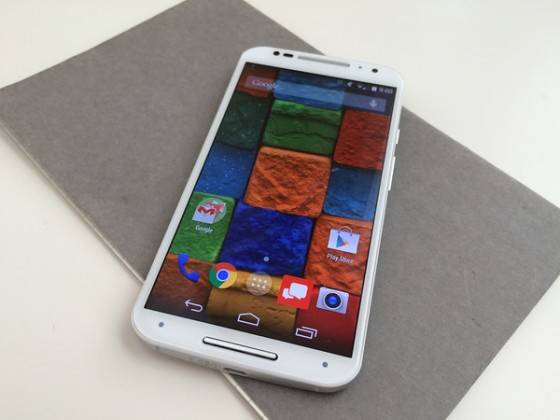
At first glance, the 2014 Moto X looks like a bigger version of the 2013 model. The horizontal curve (when held in portrait) along the length of the rear cover is still there, and the button layout is the same.
Making their appearance known are the front-facing speakers, which stare at you menacingly on the top and bottom of the front bezel. A metallic lip juts out from the center of those speakers, and is the only interruption on an otherwise perfectly smooth and flat front surface.
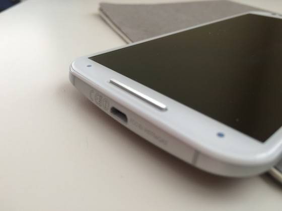
Aesthetically, the front is much busier than the original. Four sensors and the metallic speaker “grille” are a punch in the teeth. A front-facing camera with flash is also on board, making it a lot less sleek than I’d hoped for.
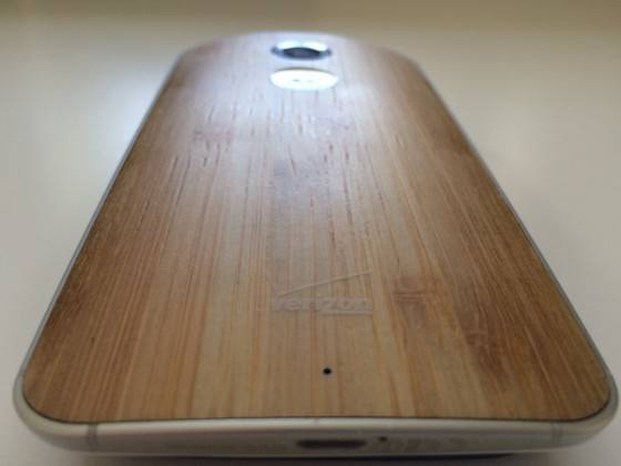
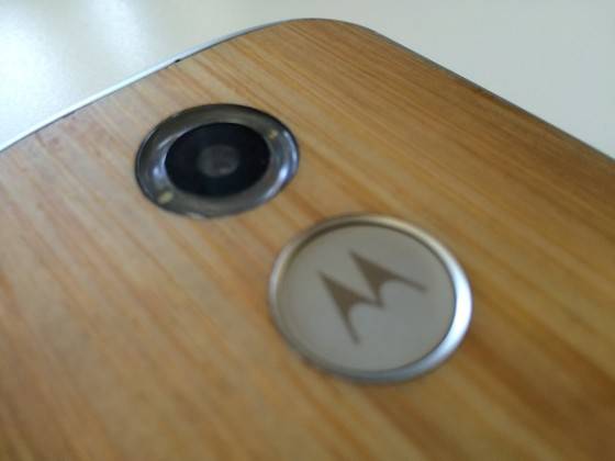
Around back we’ve got wood. You can customize your Moto X via the online MotoMaker portal, but Motorola sent us their wood version. Texturally, it feels strange, but familiar and nice. I do enjoy that when the device heats up, the wood dissipates that heat nicely, making it more warm than “too hot”.
The sides on ours are metallic, as is the Motorola “M” dimple around back. The camera is also pronounced, as Motorola re-worked the flash to surround the actual sensor this time around.
Hardware
The 5.2-inch screen sports a respectable 1920 x 1080 resolution, which also means a 423 ppi. Corning Gorilla Glass 3 is your material of choice, here.
A 2300 mAh battery should keep you humming right along for a decent amount of time, but we’ll get to that in a bit. Dimensionally, the Moto X (2014) is 5.54-inches tall, 2.85-inches wide, and has a curvature of 0.15-0.29 inches. That curve helps Motorola say how slim the phone isn’t, too. The bulk is there at 9.9mm, but the curve makes it easy to handle.
You can have the Moto X is either 16 or 32GB variants, and there is no room for expansion. A nano SIM card is also in order.
Motorola doesn’t come right out and say it, but the Moto X runs a Snapdragon 801 processor clocked at 2.5GHz. An Adreno 330 GPU is also around, as is 2GB RAM. You’ll also have the specs you wouldn’t look hard for, like Bluetooth 4.1 (BLE) and NFC.
The camera is 13 megapixel this time around, with a f/2.25 aperture. You can take slo-mo video, or full 1080p HD at 30fps. If you’re brave, you can even get 4K UHD video. That ring-around-the-lens flash is dual LED, and performed admirably. Auto HDR, tap to capture (and focus), and 4X digital zoom round out the core specs for the camera.
Software
Android 4.4.4 is on board, and will switch right over to Android L once that becomes available. There isn’t much to say about that, other than Motorola hasn’t laid much over Android — which is something I’m very fond of them for.
They do have their own tweaks and alterations, though. Motorola didn’t make them part of the core experience, as some other OEMs do, meaning faster updates via apps.
The sensors along the front of the face are for “Moto Actions”, which let you use gestures to perform tasks. Go to reach for your phone, and the screen lights up with either the time, or icons to alert you to notifications. If you get a call, or an alarm goes off, just wave your hand over the screen to silence it.
Moto Voice is also a holdover from the original X, but has improved quite a bit. You can customize your device by name. Call it whatever you want, and it launches the assistant at your command. Happily, we find the feature itself improved, as our Moto X picked up on commands better than the 2013 model.
Moto Display is Active Display, just re-branded. It works exactly the same as before, and is what you see when you go to reach for your phone and those notifications show up. If you don’t want to use it, turn it off. If you want to customize which apps you see popping up as notification, you can do that, too. We like the granular control, there.
Benchmarks
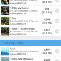
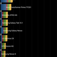
We present Benchmarks without commentary. Though Benchmarks are a good way to gauge performance, I feel that the gaming of Benchmark apps we heard about starting late last year call them into question as something we can talk about in-depth as a means of comparison.
If Benchmark results are your thing, though — here they are.
Use
I’m not sure how else to say it, but if you like the original Moto X, you’ll like this one equally as much, maybe even more. Everything about it screams “updated and improved”. The original Moto X is/was one of my favorite Android handsets, because it didn’t try too hard. The new Moto X is the same way.
The performance is mostly snappy, but there were noticeable problems. The specs mostly live up to the use-cases I have with this one. On the Verizon network — which is what we’ve tested ours on — it flat out performs. We didn’t struggle for signal reliability or strength, and the phone was able to meet our demands at every turn.
We had a big problem with Bluetooth, where music playback to an external speaker rendered the device almost useless. The Moto X would stutter uncontrollably, not allowing us to multi-task when trying to stream music to a speaker. This can likely be fixed via a software update, which Motorola is great about, but so far, no good.
Camera
You’re wondering about the camera performance, I know. In the original Moto X, it was a bit of a let-down. Adequate, the sensor just didn’t keep up last year. Will the 13 megapixel shooter do better?
I won’t go so far as to say it’s radically improved, but the 2014 Moto X camera is much better. I’m sold on the OIS, here (and on any smartphone camera, really). Flash is never great on a smartphone, but the Moto X’s odd flash doesn’t oversaturate pics.
Below are some shots taken with the Moto X 2014. I’ll let you check those out rather than talk about the camera.
Battery life
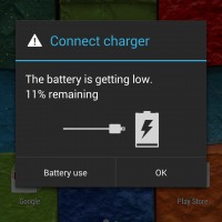
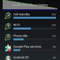
Battery life isn’t terrible, but it’s not great. Some phones, like the LG G3, have battery saving features that can get you through days without a charge. Motorola has their Attentive Display feature, which controls the screen on-time and shut-down in certain scenarios, but it didn’t seem to help all that much.
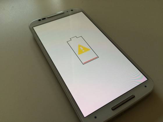
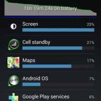
You will be plugging the Moto X (2014) in daily, if you’re a moderate to heavy phone user. In just popping around town for a day, using GPS and such, the battery life slipped away quietly. It didn’t run dry, but the Moto X was happy to see the micro USB charger when I got home. Even on standby, the drain was fairly quick. Again, we’ve seen other phones do much better on battery.
The middle pic below was with the Moto X on standby for quite some time, then using it for two 30 minute jaunts using Maps, and 30 minutes of streaming music. the standby time isn’t terrible, but in use, the Moto X needs a lot of help.
Verdict
It boils down to this: would I suggest you buy this thing? There are several other handsets out there, and some have things going for them, too. The LG G3 has a better camera and battery life, while the Galaxy S5 has an arguably better display. The HTC One (M8) is much more handsome, and has better front-facing speakers.
I am still a fan of the approach Motorola has with Android; the “less is more” take, if you will. With the Moto X, you’ll get near-stock Android, and some very slight software enhancements where Motorola felt necessary.
The solid Motorola build is enough reason to argue for its place in your pocket, and while bigger and heavier than its competition, it’s not noticeable day-to-day.

I’m not nuts about the speaker inserts sticking up off the phone, and the metallic plastic around the edges doesn’t feel premium to me. The white-faced review unit, with its sensors and such showing all the time, isn’t one I’d buy for myself.
The larger profile for the 2014 Moto X actually left me resting a finger in the Moto “M” dimple around back. I wasn’t using that last year.
The camera is noticeably bigger, but it’s not unsightly. I am enamored with the curves all the way around this device, too. In either portrait or landscape, this is just a joy to put in the hand.
There are ups and downs, here, but the 2014 Moto X is definitely worth looking at for your next smartphone purchase, especially with it’s $450-or-so price tag. Customizable, efficient with Android, and sporting a respectable camera, the Moto X is the Toyota Camry of smartphones. You’ll get everything you want, but likely won’t miss the bells and whistles you don’t have.








Metallic plastic around the edges? That is aluminum.
Exactly what I thought, I’m buying one next month, and a Moto 360
Yeah, the trim is metal, not whatever this “metallic plastic” he’s talking about. Also, the raised speakers are the only thing that offers some protection to your screen if you drop the device.
Agreed, however after playing with my wife’s new X I can agree it does not have a premium feel in the least, despite it’s actual quality.
I have to say, I created an account just to post and let you know I really enjoyed your review. It was not in the least bias and to be honest I was half expecting an overall critical review! Nice job remaining objective!
Next time post exact screen-on time.
“Try to hard” or “Try too hard” ?