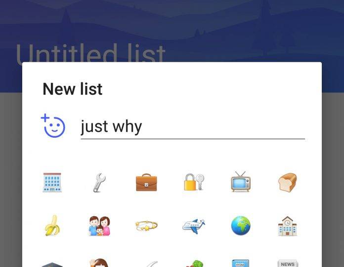
The simple interface and UI of the Microsoft To-Do app has made it a recent favorite among mobile productivity addicts. The latest update to the app brings a few improvements and minor new things, and a weird feature that no one probably asked for. Emojis are the last thing you would actually need for a to-do list app, but here we are, with an emoji picker, even though your keyboard probably has its own emoji picker as well.
But even though it’s practically useless, when you update your To-Do app, you will see an emoji picker so that when you create a new list, you can easily choose the emoji that you may need. We’re not really sure what other function this will perform when you do your lists, but okay, it’s not like you’re paying extra for it or something. The update also brings new looks for the icons, making them “a little more bold”.
If you’re using To-Do and you decide to go into split mode, you will stay in the list that you’re currently, as it should actually do. And if you’re using both Android and Windows devices, your lists will now look the same across all the apps and devices. Switching lists in the Quick Add mode will also now open your keyboard, which previously caused annoyance with some users when the keyboard didn’t show up.
Accessibility is also being continuously improved as per their changelog. You can update your Microsoft To-Do app from its Google Play page.
VIA: MS Power User


