Every once in a while, apps need to undergo a makeover to make things fresh and in theory, easier for their users. Some get worried and annoyed that the thing they’re used to is changing and they have to adapt, while some are excited to see what changes and improvements a major update will bring. Users of Microsoft’s OneDrive can now expect a major change to the mobile app they’re used to, but most of it is really for the better as you get a brand new look and feel, plus easier navigation for the things you need to access the most.
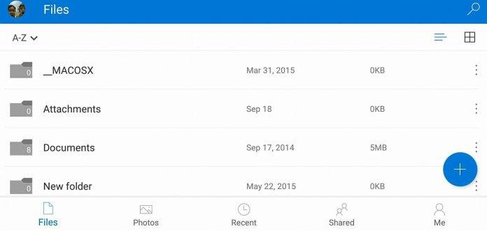
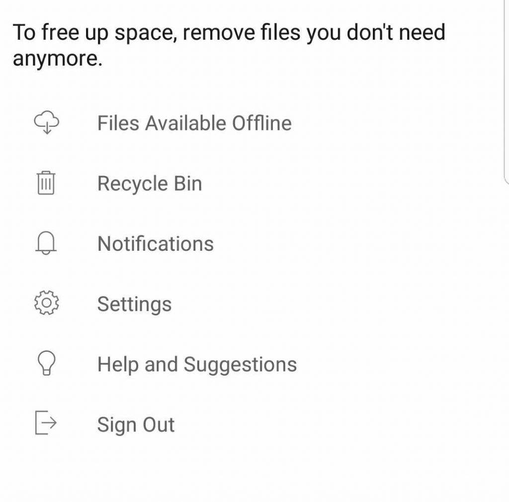
One of the major things you’ll notice once you’ve updated to version 5.1 is that the hamburger menu is gone. Instead, you get tabs at the bottom of the screen for Files, Photos, Recent, Shared, and a Me tab. That last one contains files that you can access offline, notifications, a recycle bin, plus settings, suggestions, and sign out if you need to. You can also now see a Free space option in case your storage is already full, and it will advise you to remove photos and videos.

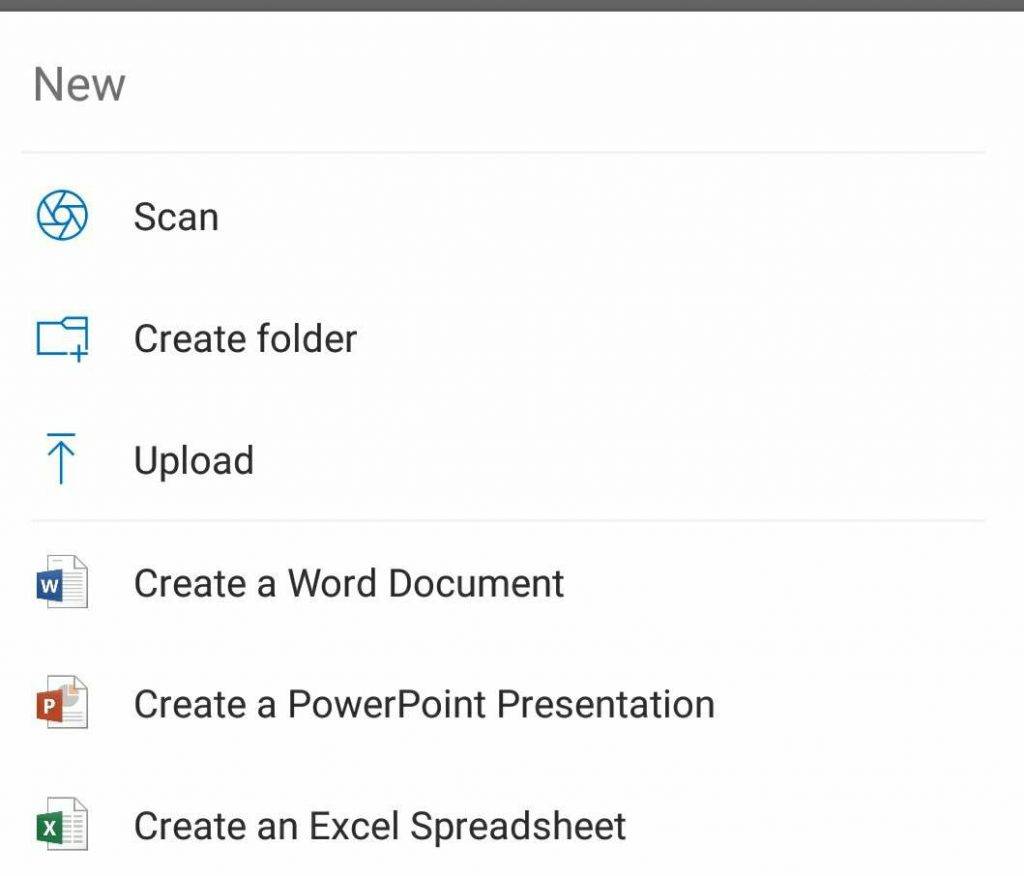
The + button in the home page lets you do the usual, like scan, create a folder, or upload a file that you want to save to the cloud. And if you didn’t know it yet, you can actually create a new Word Document, PowerPoint Presentation, or Excel Spreadsheet from your OneDrive, provided you have the necessary apps installed in your mobile device.

Update your OneDrive app to version 5.1 to be able to enjoy this new look and the new navigation. It also comes with the usual bug fixes and improvements.


