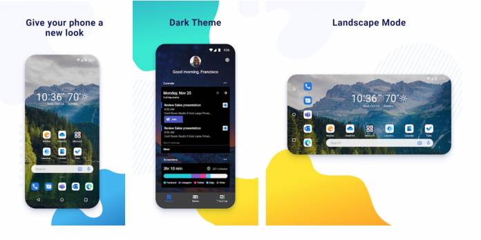
If you’re a fan of the Microsoft Launcher app, you might want to check out a new preview version to get a, well, preview, of what may be coming to the stable version later this year. Microsoft Launcher Preview 6.0 is now available and it brings you better dark mode features, landscape mode, and a more organized user interface. In fact, Microsoft re-wrote this preview build from the ground up to create an even better version of the already popular launcher.
Unfortunately, since they basically wiped the slate clean with this build, some features were removed, but hopefully the new things will more than make up for it. The transparent theme and the system theme options are now both gone. But some elements of the transparent theme are still with the other two themes left. The automatic switching from light to dark with the system is still there but now you can’t turn it off. You also won’t see the option to change accent colors anymore.
On to the good stuff. The left home screen feed gets a new look with more consistent layout, colors, and other UI elements that are more organized. The app drawer also gets a new look with the recent apps separated from the other apps with a horizontal divider. There is now also a bold search bar at the top and it will change shape depending on how you customize the main search widget.
You will also now be able to use the Microsoft Launcher in landscape mode for Preview version. This is especially useful for those who are using their smartphone as a mobile working device with Bluetooth keyboards or connect it to larger screens. This will also be good for those with Android tablets later on even if the preview version is only compatible with smartphones. The current stable version of Microsoft Launcher is not all that friendly for tablets.
You can use both the Microsoft Launcher Preview and the stable build and switch between the two if you want to see the differences. Just expect that the preview version will have a lot of bugs and crashes since it’s only on the alpha build.


