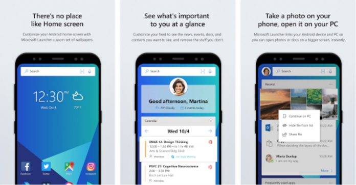
If you’re part of the Microsoft Launcher beta program, we have good news for you! They’re rolling out a new update that should improve your use of what is formerly known as the Arrow Launcher. If you use the stable version, the update isn’t available for you yet, but it will probably arrive soon. The new features and UI aren’t major improvements, but they should make your life easier, which of course is what we all want from the apps we use. Well, mostly.
The new or improved features have been requested by users for some time now, so having them here, no matter how minor, is goodwill for the app. You now have app grid options, if you prefer to see your apps in a 12 x 12 grid layout and half grid granularity. You can also now migrate your saved features or details from one app launcher into Microsoft Launcher so that some of them don’t get lost.
There will be some other small things you’ll notice have improved in this version. When you drag/drop an app, it will no longer go into edit mode (which was kind of annoying previously). UI adjustments include the ability to edit the app title font display and folder/icon shape and more than five apps now allowed to have dock support. The default placement of the search bar is now at the bottom and the setting page has been restructured.
There are also the usual bug fixes and improvements with this update. Remember, they’re rolling out on the beta version first but will probably be available soon on the stable Microsoft Launcher. Just check the Google Play page to see if it’s rolling out already.


