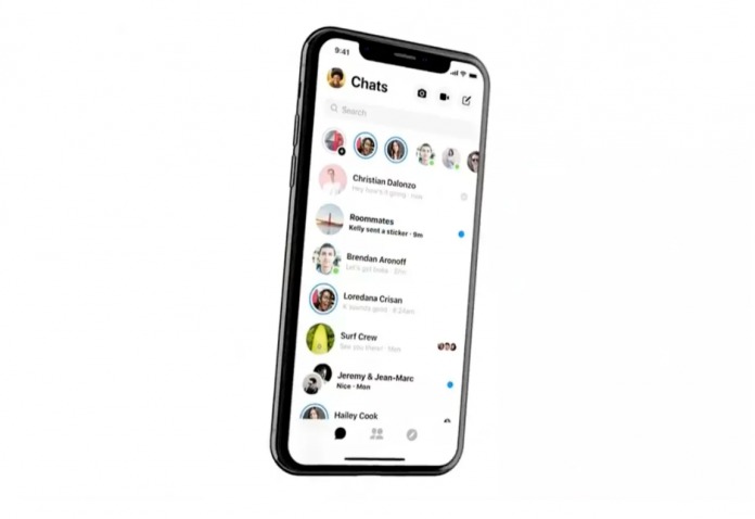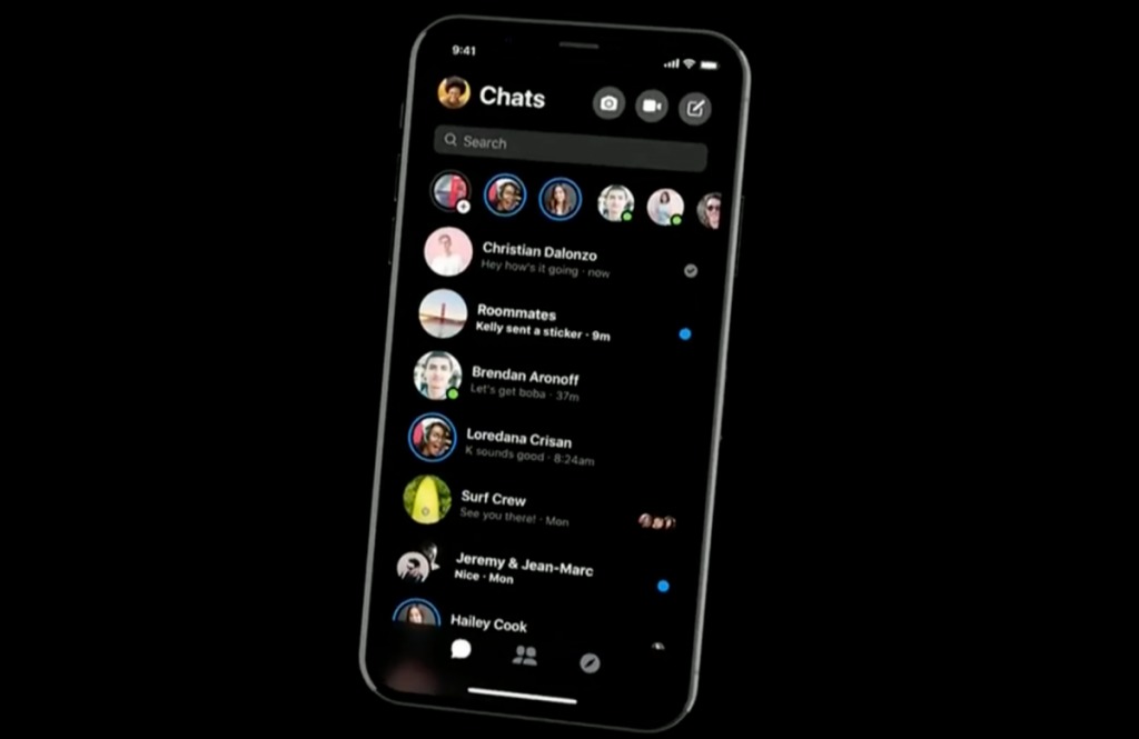
Some developers are realizing that people don’t always want bells and whistles when it comes to their apps. The simpler, the better. When it comes to messaging apps, we of course like to add some fun things, but if things become too bloated, we get turned off (not to mention it depletes our battery and data). That’s what’s happening with Messenger but it looks like Facebook is now listening to users as they have announced the app will be undergoing a design overhaul to make things simpler.
At the ongoing F8 developer’s conference, Mark Zuckerberg shared during his keynote that they are completely redesigning the Messenger app to bring users a “simple and fast experience” which is what we’ve been asking for. Later on he focused on the words “clean” and “fast” again, which means we can expect something “radical” in terms of design. Well, radical for a company like Facebook whose products tend to be too bloated and packed with features we don’t really want or need.
We can expect the Messenger app to have a dark mode in order to be kinder to our eyes and also because OLED smartphones are continually growing. The bottom navigation will have three central tabs that will focus on communication tools. The camera and video chat icons are still found on the upper right but design-wise, it looks like they’ve streamlined everything to make it easier to use.

Facebook’s Vice President for Messenger David Marcus shared that they have been working on the redesign since early this year. It will come to users “very, very soon” but no specific date has been announced.
VIA: The Verge


