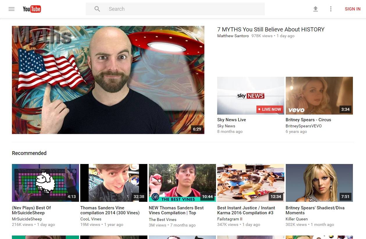
While most, if not all, of Google apps on smartphones and tablets have already adapted the Material Design visual guidelines, the web-based properties still have some way to go. The YouTube on your browser seems to be getting a makeover soon, as some people and sites have reported that the video-sharing channel is testing out a new UI for selected users. While the differences don’t seem to be much to the naked eye, those who are visually attuned will be able to spot the changes easily.
In terms of features and usability, nothing much will change of course, but Google probably wants to try it out first to a select group before releasing it to the wild. The home page will have a more modern search bar and the word upload will be replaced with the icon for upload and both of these are actually already found in the mobile app. In terms of the slide-out menu, the redesign is a little more obvious, especially in terms of the round icons and the white space as well.
Moving on to the channel page, the top matter will take on the color that is most associated with the page so that it will feel more like an actual page rather than just a lookalike of the homepage. There is a rounding going on here as well, like with the profile photo and the horizontal browsing button. In the video player, which is where most people spend their entire time on YouTube anyway, there aren’t any obvious changes, unless you look really close. There isn’t any shaded gray in between areas so you have a cleaner and smoother look.
If you’re not one of the chosen few to receive the Material Design UI makeover, a Redditor has found a way to do so (click via link to find out how). But if you just plan to wait with the rest of the world, then just let Google do its thing until the changes roll out eventually.
VIA: Android Police


