Before Dropbox made headlines by giving a board seat to Condoleezza Rice, it somewhat rocked the Android world by unleashing some of its apps to the masses, including the already popular Mailbox app. Now we take an in-depth look at this email client that wants to change the way you think about and handle your mail.
Inbox Zero
Those familiar with productivity trends of the past decades will probably know the phrase “Inbox Zero”. Simply speaking, it means keeping your inbox as empty as possible, preferably at the end of each day. Just as physical office inboxes aren’t meant to remain filled, the Inbox Zero mentality encourages people to sift through emails and put them where they belong and not treat the Inbox like one giant archive. To that end, Mailbox implements a certain workflow that encourages, or even enforces, such a paradigm. Whether or not that is something the user actually wants is left as a matter of personal opinion and choice.
Getting Ready
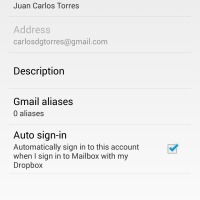
First time Mailbox users will immediately see the most visible effect of Dropbox’s acquisition of this little app. Users will be asked to log in to their Dropbox account. This enables Mailbox to store its settings on the cloud and have them replicated on other devices. You also get the option later to automatically sign in to an email account whenever you sign in to Mailbox using that same Dropbox account. Cloud-based convenience at its finest. Almost everyone has a Dropbox account nowadays anyway, though how long that will remain true is yet to be seen.
After this, Android users immediately hit a bump in the road. You only get to choose between adding a Gmail account or an iCloud account. No custom IMAP, Exchange, or any other email sources. Dropbox assures as that this limitation is only temporary, but in true marketing fashion doesn’t say for how long.
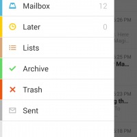
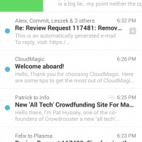
Should you decide to press forward, you will be greeted by a beautifully minimalist app. Perhaps too minimalist to some aesthetic senses. And yes, it does reek of the iOS roots it sprouted from, but there will always be those who will appreciate beauty no matter its origin. Those at home with apps in the vein of Any.do or Todoist will be on familiar ground. Those seeking for hidden switches and toggles might do well to look elsewhere, because in Mailbox, what you see is really what you get. It is simple and clean, with nothing else to worry about other than surviving your email.
Different strokes
As mentioned earlier, Mailbox enforces a particular workflow and mindset. You deal with a single email independently and decide what to do with each one before you are able to go to another one. In short, you will find no bulk actions here. On one hand, it encourages users to face each email one at a time. On the other hand, it will give your thumb or index finger one hell of an exercise, as everything here is driven by a swipe.
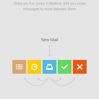
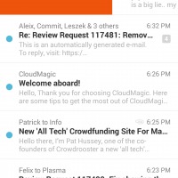
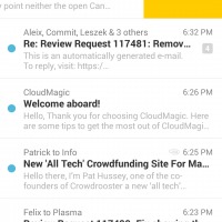
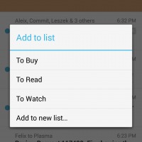
Swipe an email half way to the right and you throw it to the Archive, marking it as read in the process. Swipe all the way to the right and you get to delete that email. The opposite direction also has similar mechanics. Swipe half way to the left and you are offered the chance to “snooze” the email. More on that later. Going all the way to the left lets you put the email in any one of the lists available or make one of your own choosing. This half/full swiping convention is actually implemented in any section of the app, whether you are viewing the inbox, archives, snoozed emails, and lists.
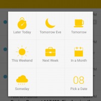
Remember that Mailbox is built around the concept of Inbox Zero, so the goal is to empty that email dumping ground, whether you archive it or delete it. It doesn’t mean, however, that you need to act on them immediately. You can definitely put off reading or taking action, which is what that Snooze option is for. Think of it as a personal email forwarding or reminder service, hiding the email and then showing it again at an appointed time, whether to let you act on it or just to remind you that it exists. Some have hailed this feature to be the best thing there is about Mailbox, forgiving the apps faults, of which there are quite a few.
Doubt before englightenment
Getting into Mailbox might be a bit of a pain, as some comments over the Internet might show. One subtle but important step in setting up a Gmail Mailbox account revolves around the All Mail label. Users must remember not only to make the label visible but also to have it shown in IMAP. Should you fail to do so, you will simply be greeted with an ambiguous error message that tells you neither reason nor fix.
![]()
Again another Gmail-related quirk is that Mailbox doesn’t support Gmail labels. In fact, it doesn’t support folders at all. It does have lists, but those are separate groupings that show up as separate labels in Gmail. If you already have an email filing system down to a T, then you might find it hard to adjust to Mailbox’s rigidity.
Swiping is how Mailbox works and that allows it to shave off much of the interface chrome that burdens other email apps. Unfortunately, that is also a weakness. Such swiping gestures are best performed with one hand, but only if you have a sizable smartphone. Luckily, your other hand’s index finger can also be employed for that purpose. But like any other gesture-based interaction, it does require a certain level of accuracy and muscle control.
But lastly, perhaps the greatest mental hurdle to using Mailbox, which is ironically probably also its greatest strength, is that it is not just an app but also a way of thinking, about emails, that is. The app’s features encourages users to aim for that Inbox Zero nirvana, but not all users think that way. You will definitely hear of some who use their Inbox as their Archive, and they will definitely find Mailbox a bitter app to swallow.
Wrap-Up
Mailbox is a very interesting take on an age-old productivity software. It is simple, clean, beautiful and, best of all, it works. Its biggest flaw is that it actually forces its own paradigm on users, not all of whom subscribe to such a way of working. For these, there is no dearth of email apps on Android to choose from. But for those who have already been following the path to email zen, and aren’t too attached to Gmail labels, they will probably find no better app than Mailbox.





Well written article. The lack of label support is unfortunately a killer for me
Thanks! Labels were the deal breaker for me as well. I’m not sure why Mailbox chose to work that way since it already supports labels via lists. Too bad, the rest of the app is nice.