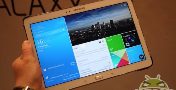
If the new crop of Samsung tablets has you ready for the February 13th launch date, we’ve got something for you to consider. It seems their new Magazine UX can’t really be turned “off” as we were led to believe. Instead, users must keep “at least one” Magazine U screen up at all times.
Speaking to Computer world, a Samsung spokesperson says there must always be Magazine UX around on the Galaxy NotePRO and TabPRO devices. While we never really bought into the rumor that Samsung would get rid of Magazine UX, we didn’t think they’d force it upon us, either.
The Samsung rep was quoted with the following. In the statement, we see that Samsung is remaining opaque about their offerings, as well as stance on customization:
Users do not have the option to ‘turn off’ Magazine UX. It is built into the Pro series tablets. Users can add or delete Magazine UX and standard Android screens as they wish, but at least one Magazine UX screen must be present at all times. The ‘classic’ home screen is standard, with the Magazine UX accompanying it. And of course, users can change this and set Magazine UX as the default.
Magazine UX is nice, but at CES we were led to believe it could be disabled and relegated to the background. We’re all for eliminating fragmentation in Android, but on the same device? Either provide Magazine UX or don’t. If Samsung wants it to be a new thing for their tablets, that’s great — just make it standard. If Samsung wants to give us a choice, then let us make that choice as we need, and don’t force “at least one” Magazine UX screen on us.
Source: Computer World


Just swipe to the right (or left) and you’ll be on the normal Android Touchwiz UI. Don’t see why it’s a problem. It’s kinda like how HTC implemented Blinkfeed (so they might let us remove it completely in the future).
I don’t want to have to swipe to the right or to the left to get to the screen I want
Use a launcher then
Is this how lazy we’ve become?
If you install Go Launcher, will it replace it?
Yeah it should do.
I won’t buy anything with magazine ux if I can’t disable it