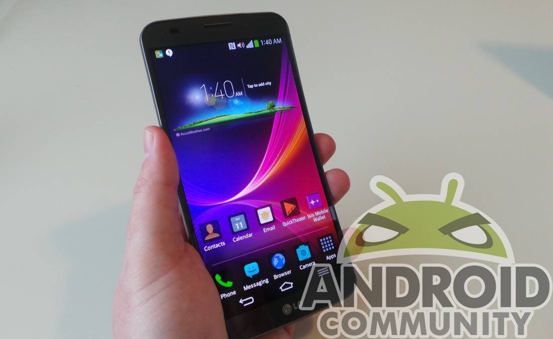
The LG G Flex is officially stateside. Via AT&T, you can now pick one up, and enjoy the 6-inch curved OLED screen for yourself. If you’re curious about the curved device, you’re reading this review as a means to decide if it’s the right one for you. Certainly polarizing, the G Flex stands out in a crowd, but does it do so in the right way? We find out.
Hardware
Hey, did you know the LG G Flex was curved?! Joking aside, it’s the first thing that strikes you when you pick it up out of the box. In a straight-on view, the G Flex doesn’t look different from a normal smartphone, aside from being huge. Pick it up, and you’re immediately struck with its top-to-bottom curvature. LG says that after many iterations, their sample audience preferred that particular curve, which is 700R (a 700mm radius). According to LG’s research, two-thirds of those sampled preferred the curve to a flat device, and it tested highest when pitted against both flat devices and that with another curvature.
The screen is OLED, but it’s also plastic. LG calls this “POLED”, and notes it has a “Real RGB” panel as opposed to a pentile display. LG calls this “the most advanced flexible display technology developed by LG Display”. In curving the display, and offering their not-so-subtle media viewing options (more on that in a bit), LG is clearly trying to bring their cinematic TV experience to the mobile realm.
The device itself is plastic, and feels as much. All the way around, this one feels like the plastic some lament from Samsung — smooth, and without a hint of heft. LG’s real panel is said to be “self healing”, as minor scratches are alleged to heal themselves. That’s obviously really subjective to the type and severity of the injury to the phone, but it is definitely made of something different. That may be why lint is so attracted to it. The second you clean the G Flex, it’s lint-y again.
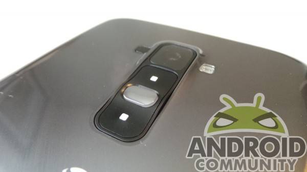
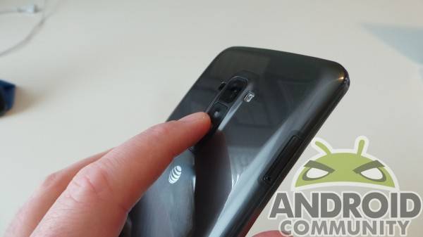
Around back, we find the volume rocker and power button sitting just under the camera, which is another touch LG has caught flak for lately. It’s meant to keep the bezels slim and sides tidy, and it absolutely works to that end. While we’re not crazy about it in general, the button assembly is almost necessary on a device this size. Even with my appropriately sized ‘man-hands’, side buttons would have been difficult without juggling the device like some sort of ben-wa ball trick.
The size is where we really find issue, here. It’s big, measuring at 6.32″ (H) x 3.21″ (W) x 0.33″ (D) overall. The curve is meant to help ease that size tension, but it’s more noticeable in certain situations. In the pocket, the top and bottom of the device were evident, almost prodding me. In the back pocket, it was similarly strange. Unless the curve happens to fit you perfectly, the G Flex creates more space than it solves for. Keep in mind that I’m not a petite soul, and don’t have small pockets. For those ladies out there who have their iPhone sticking out of the back pocket, the G Flex is likely to be far too large.
Rounding out the specs we find a Snapdragon 800 at 2.26 GHz, 2GB RAM, Adreno 330 GPU, the curved 6-inch OLED display at 1280 x 720, and 13MP rear camera with a 2.1MP front shooter. The curved battery under the rear cover (which can’t be removed) is 3,500 mAh, and it’s running Android 4.2.2 out of the box. LG puts their software touches on the device, which we’ll get to a bit more in-depth.
Software
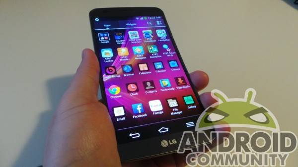
As mentioned, Android 4.2.2 provides the core functionality, but it’s hard to tell it’s there. LG’s skin is getting very, very heavy — and it’s showing. LG’s offering is starting to act a lot like TouchWiz in that it nearly suffocates Android on the device, but LG has some useful tweaks to make up for it. As a stock Android fan, I don’t find the LG touches as bothersome as TouchWiz, but I also see places where they could just calm it down a bit — or at least I wish they would.
There are a veritable ton of extras slapped into the G Flex, and some are uniquely useful on a device this size. LG’s ‘Dual Window’ feature lets you use two apps at once, side by side. One-handed operation lets you adjust the keyboard to make for better use with a single paw, and ‘Smart Screen’ keeps the device awake when it detects eye movement. Yup, those all sound a lot like Samsung features, which is why I mentioned them. While useful and cute, most of the tweaks LG has could be jettisoned in favor of being a device that doesn’t want to stand out so much.
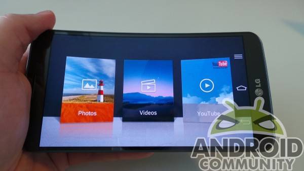
That’s not to say it’s all bad news, though. The ‘Dual Window’ thing is, like on Samsung handsets, very useful for multitasking, and a joy on a larger device like the G Flex. Q Slide is equally productive, and allows you to overlay apps in windows as you would on a desktop. From the lock screen, you can hold the device in landscape and swipe with two fingers outward to quick launch media. That’s a very neat function, and speaks to LG’s desire to make this a media monster.
On startup, we’re immediately reminded this is an AT&T device. There are eight apps from AT&T on the device, and most — if not all — could just go away entirely. For a device this software heavy, the bloat doesn’t help, and only promises to slow down the update process, should this one ever see an Android update. There are also these little tips and tricks that pop up at every turn, which actually annoy more than they help. You have to dismiss each one, and select to not have them show up again — each time. It speaks to LG’s heavy overlay as having a big learning curve, which is probably something they should consider for future iterations.
Benchmarks
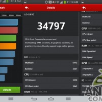
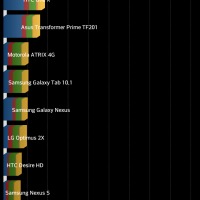
Below, fans of benchmarks get what they desire. We’re going to present these without much commentary, considering the checkered recent past of benchmark scores. Considering the specs, though, we’re not too surprised the G Flex scored as it did. Just ahead of the Note 3 in AnTuTu testing, the G Flex keeps up where and when it needs to.
Battery
With a 3,500mAh battery, we expected this one to last — and it did. A lot. Over the course of four days, it was actually difficult to get it to drain down to empty with normal use. That’s thanks in part to the screen, which isn’t as pixel-dense or demanding as it could (maybe should) be.
We did get it to drain, but not after watching a slew of YouTube videos we didn’t really want to, all in the name of running the battery down. It naturally took a lot longer to charge back up than your Moto X or similarly smaller device, but it also lasts a lot longer. For something as potentially draining as the G Flex could be with all it’s Android tweaks and multitasking prowess, the device held up really nicely in battery testing.
Camera
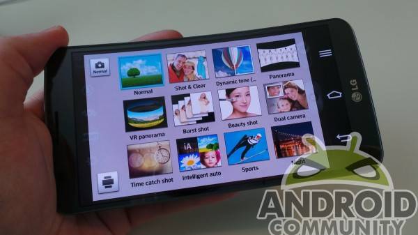
As before, a whole slew of features are packed into the camera. The resolution maxes out at 4160 x 3120, and is 4160 x 2340 by default. There are more shooting modes than we’d care to discuss (as seen above), and they almost all remind us of some Samsung camera mode. Time Catch Shot, two different panorama modes, Beauty Shot — it’s a bit much. Cheese Shutter is nice, in that the photo snaps on a voice command, allowing you to get in and get set for that family pic.
Video shoots at a maximum 1920 x 1080, with a 60fps frame rate being the maximum. A digital “Anti Shaking” serves as your OIS here, and there are some neat tricks like “Tracking Focus” in which you can tap to focus on an object while recording. Nothing new, but we found it really responsive and nice. Live Zooming lets you zoom in and out during playback, which is really cool, too.
Below are some shots with the G Flex camera, and we’ll let them speak for themselves. At 13MP, it’s not a Sony Xperia Z1, but it didn’t let us down, either. We’ll do some camera comparisons in the near future, just to have a side-by-side for what the G Flex offers vs other devices in use by Android fans — and even an iPhone for good measure.
Conclusion
The curve: function, or fun? We actually love the curve for landscape stuff. It felt more natural in the hand when holding it in that mode, which we didn’t consider at first. It is, however, slightly disorienting otherwise. In portrait mode, the top of the screen almost peels toward you, which is just weird. We get the “tiny TV” thing, but a smartphone is more than a media consumption device. Had this been a tablet, we’d get that angle (pun intended).
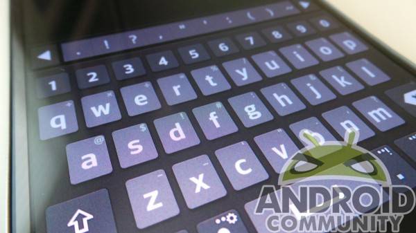
Aside from being curved, the screen leaves a lot to be desired. At 1280 x 720, it was grainy, even with things like the stock keyboard in Hangouts. App icons look terrible, and the entire color scheme is muted to a point it’s noticeable to all. The screen is almost a slap in the face to Developers who worked so hard to make apps look great, only to have them show up on this screen as a shell of themselves.
LG’s Android skin is subjective, so we encourage anyone interested to try it out thoroughly before locking themselves into this device. There are a lot of useful features, and a lot that are likely unnecessary and will be used sparingly. If you’re one who wants Android updates pretty quick, it won’t happen here, so be prepared for that. The phone may be exactly the same in two years’ time because of such an overlay.
That being said, we find LG’s take on Android — heavy as it is — fairly pleasant. It takes some getting used to, but isn’t too much (yet). Camera tweaks will require more toying with and experimentation than you may want, but once you get them down, they’re fun. The multi-tasking features we spoke of are great if you need them, and the specs keep things moving right along without a hitch.
If LG was trying to re-imagine the form factor of a smartphone, they’ve done as much. I don’t think we can consider the current G Flex successful, though. The screen is lacking punch, and the curvature didn’t seem to fit anywhere in life comfortably. On a flat surface, it’s announcing its curve. In a pocket, it’s bulkier than we want. In the front pocket of a laptop sleeve? Same thing. Comfy to hold, but it creates more negative space when not in use than a normal phone would. If it had a more pixel-dense screen and a more subtle curve, we’d probably like this one quite a bit. We still like it, but more because it’s novel, not because it’s a great smartphone. With a second iteration, this could be one you’re seeking out more for its utility than its curiosity.




I love my LG G2. The Flex’s size is just a little too much for me. And I carry it in my pocket. The curve won’t work for me. I really don’t see the need for a curved mobile device. How much more comfortable can it be holding it. And it’s not like you are going to have an omnimax experience on a 6 inch device. Neat idea and props for innovation, but it’s not for me.
most things you buy are about trade-offs; you get something you particularly want while sacrificing something you might otherwise have been able to get. but here we have a device that’s curved– why? it’s baffling– whose trade-off is a dogshit screen (Ars Technica’s review shows just how bad it is). so we get nothing in particular we want and have to sacrifice something we did. this phone isn’t worth a mouse fart in a hurricane wind.
lol you don’t even know what your talking about the greys on the flex are grainy yes but the screen clarity actually compared next to the g2 the flex looks better. the curve i was against before but i can see the use for it now. you should really try the phone before you knock it. i came from a note 3 and lg g2 btw and this flex i have now is by far the smoothest and fasest phone I’ve ever had.
If they had made this a 6″ 1080p phone with a non-curved screen, it would have been a hit.
Turn the brightness up to a 100.. The battery last forever so the brightness isnt a problem. With the brightness turned up, there isnt a screen out there looks better. this phone is a amazing. All other phones should just stop being made. There all small and retarded. Lg G Flex 2 will prob be the best phone ever made.