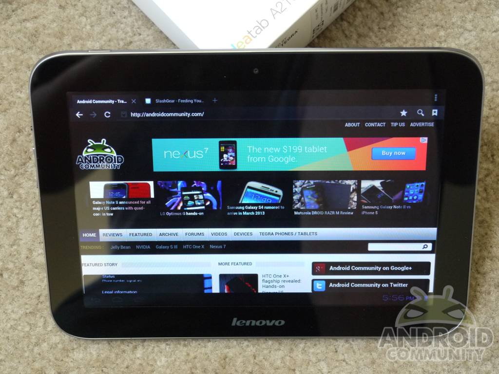
Lenovo is back in the Android tablet market with a slew of new devices, and today we’ll be taking a look at their budget offering. Lenovo recently announced their A2109 as an option for those that love the Nexus 7 specs, but want a bigger display. With a 9-inch HD screen, the NVIDIA quad-core Tegra 3 and more can the A2109 compete with Google’s own Nexus 7? Find out below in our full review.
Lenovo has released a few odd Android tablets in their short period in the Android game, and this time around they’ve aimed for something more mid-range and budget friendly that will hopefully appeal to the mass market. Can this quad-core powerful device earn your dollar? Here’s what we think.
Hardware
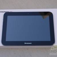
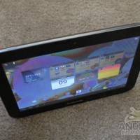
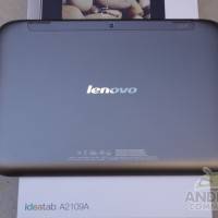
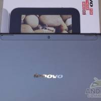
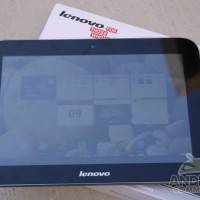
As soon as you pull the IdeaTab A2109 out of the box you’ll feel good about the initial hardware. The device is somewhat heavy because Lenovo opted to wrap the entire thing in a lightweight aluminum. Their past tablets looked aluminum, but were in fact cheap plastic. Here we have a full aluminum metal design, which adds to the weight, makes it pretty slippery in hand, but also gives it a very durable feel.
I was really hoping to love this tablet. It offers nearly everything the Nexus 7 does and then some — only for $50 more. Sadly just like recent attempts from Lenovo, the hardware is a failure. They’ve equipped this slate with a 9-inch 1280 x 800 HD resolution display, but unlike the IPS quality of the Nexus 7 we have an extremely cheap TN panel. This is by far one of the worst “HD” screens I’ve seen on a tablet to date, but more on that below. As far as the full spec sheet we have the 9-inch HD display, NVIDIA’s quad-core Tegra 3 under the hood for plenty of power, 1GB of RAM, a 3 megapixel rear and 1.3 front camera setup, and the tablet is running on Android 4.0 Ice Cream Sandwich.
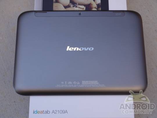
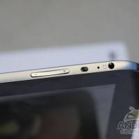
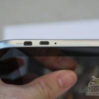
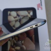
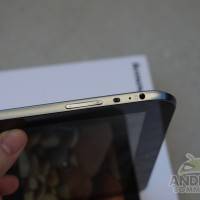
Sounds similar to the Nexus 7 right? The IdeaTab A2109 comes standard with 16GB of internal storage, the larger screen, a rear facing camera, and even HDMI-out all for just $50 more — costing users $299. On the upper right side we have micro-HDMI, micro-USB, and a noise cancellation mic. With nothing on bottom, the left side estate is covered with the volume up/down rocker, screen orientation lock (which is tough to switch) and the 3.5mm headphone jack. Then up top we have the power and wake button. The back of the device houses the rear 3 megapixel camera, micro-SD slot, as well as the top mounted SRS stereo speakers.
While we love the placement of the speakers and the fact that we have SRS surround sound stereo speakers, they sounded quite rough. We love the idea of top mounted speakers so they don’t get covered by your hands, and they even added little metal feet to keep them off any surfaces to stop muffling. Sadly the quality just wasn’t there, but certainly better than some. We like the idea and effort.
The back has an almost purple hue to the aluminum design while the sides has a nice shiny brushed aluminum finish that looks and feels quite nice. Overall I’m extremely impressed with the build quality for a Lenovo device, as their past products have left us wanting more. Sadly the screen here kills all hope since that’s one of the most important parts of a tablet.
Display
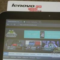
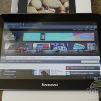
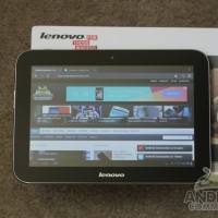
As if we didn’t make it clear above, the 9-inch 1280 x 800 HD display on the A2109 is by far its biggest con. The colors are horrid, and the viewing angles are some of the worst I’ve experienced from a tablet of this caliber. The pictures won’t do justice, but I’m extremely worried about this display. Everything has a strong blue tint, and there’s no fresh whites or quality blacks to speak of. Everything is grainy considering the resolution, and any IPS or AMOLED display will have this beat with ease. The Nexus 7 has a gorgeous display, and is still not the best around — it’s safe to say this is bottom of the barrel.
Those images might not do justice but barely any angle you lose absolutely all color quality (the little it had) and any forward angle you’ll almost completely lose sight of what’s on the screen as shown above. Tilting either direction (even a few degrees) colors get distorted, making it hard to make out what’s on the screen. Typing was extremely hard if angled at all — to the point I couldn’t even see the letters on the keyboard. Can you see the spacebar in my image above? Nope! Lenovo certainly kept the price down with the screen, and sadly that makes this experience very hard to recommend.
Software
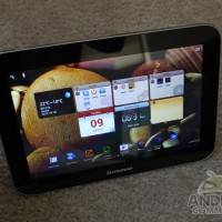
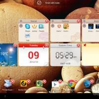
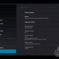
As far as software is concerned we have a somewhat stock version of Android 4.0 Ice Cream Sandwich. For the most part it is completely untouched aside from the home launcher. Lenovo altered the launcher by basically adding a few custom widgets, and changing the swipe from screen to screen animation effect. That aside this is basically vanilla Ice Cream Sandwich which we love.
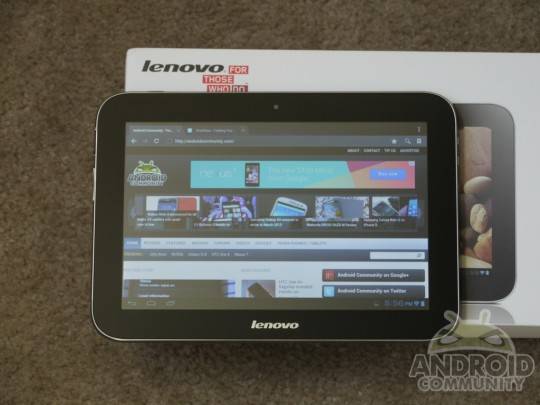
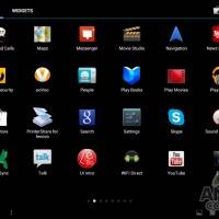
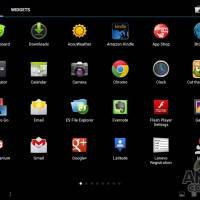
Lenovo is one of the better MFG’s in terms of bloatware. We only have two minor pages mostly of useful apps. Some of the pre-installed apps include GO keyboard, AccuWeather, Kindle Reader, Cut The Rope, DocsToGo, Norton Security, some news feeds, and the Zinio reader. They’ve kept things rather simple here, which we like. Then as usual we have all the popular Google apps to keep things fun.
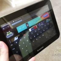
Overall Android 4.0 Ice Cream Sandwich runs just fine thanks to the Tegra 3 quad-core processor under the hood. Performance was decent but we noticed significant lag at times while typing. The on-screen keyboard would lag at times and occasionally be unresponsive. This could be in part due to the screen they’ve used, and not the actual software. Lenovo’s custom widgets are a nice touch, and the small animation changes are a welcomed edition as they don’t slow down or hinder the user experience. Chrome Browser comes pre-installed, which is nice although doesn’t support flash. Overall the software runs great, is smooth, and operates as expected once get use to the display quality.
Benchmarks
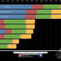
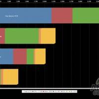
Being powered by NVIDIA’s popular Tegra 3 quad-core 1.2 GHz processor we had to benchmark this little thing. Just as we expected performance was stellar. The quad-core scored quite high, being on par with the Transformer Prime’s faster version of the Tegra 3. We scored well over 4000 in Quadrant. Here’s the results
Camera & Battery
Lenovo’s added a 3.1 megapixel camera to the rear, and a 1.3 front for a quick self portrait or two. Being just 3.1 megapixels on the rear video recording isn’t anything special, and image quality varies with lighting conditions. Indoors we rarely were able to get a decent photo, and auto focus was certainly not included. Outside images were decent enough for a quick photo or two, but you’ll need a smartphone or actual camera handy. Here’s a few samples:
Battery life was rather impressive here with the A2109. Running on NVIDIA’s Tegra 3 you know you’ll have optimal battery performance thanks to the 5th ninja core doing all those daily tasks, and conserving battery for when the tablet needs all 4 cores. The 6,000 mAh battery lasted about 3 days with a casual use here and there over the weekend, but on continued use battery life was closer to the 7 hour mark. Battery life is one of the few strong points with this tablet.
Wrap-Up
In the end we had a hard time wrapping our head around this tablet. Overall the hardware design and build quality was decent — if not a little thick — the performance was great, but the screen was just dreadful. Why Lenovo went the cheapest route possible has us completely confused. With a budget device a few compromises will need to be made — but with a tablet the display can’t be one of them. This is something both Google with their Nexus 7, and Amazon with their Kindle Fire HD understand.
The quad-core Tegra 3 keeps this device moving along with ease and offers great performance with daily tasks, videos, browsing the web, playing all those awesome TegraZone Tegra 3 optimized games and more. Sadly the screen here makes this a tough sell and hard to recommend. The Nexus 7 for $50 less is certainly a better choice, and if you’d like the larger screen I’d wait another month and snag the 8.9-inch Kindle Fire HD. In the end we wanted to like this tablet, and in a way we did, but the compromises far outweighed the low price. For the average user or first time tablet buyer this could be a good choice, but we’d still recommend the ASUS Nexus 7. Enjoy the rest of the photos below.
[device id=3336]










I must disagree with you, Cory, on the screen. I bought my tablet a few days ago (for $236) and am extremely satisfied. I researched several tablets in this price range, and the Lenovo is definitely “the mostest for the leastest.” I popped in a $20 16 GB micro SD card right away, so now have 32 GB of storage. Though you and other reviewers critized the screen, I have no problem with it. It is as good as the screen on my HTC EVO 4G LTE. This tablet has features tablets costing twice as much don’t have.
_how did you remove the back cover to install the SD card?
I just got this tablet as a gift. I was unsure if I wanted a ten inch or seven. I have a ten I use for work and I always thought it was a little awkward to hold, but was thinking a seven inch would be too small. This fits the bill perfectly!! I do see what you are saying about the screen. It’s by no means a deal breaker. I love it so far……really pleased with this tablet.
I purchased mine in October and I love it. I got everything wanted for under $300. its perfect for someone on a budget.
Office Depot has this on Black Friday for $199.
Does that change the value proposition?
It is a better optional tab……