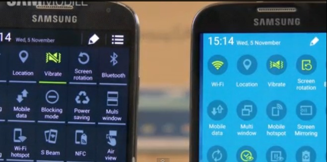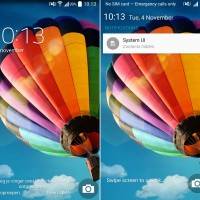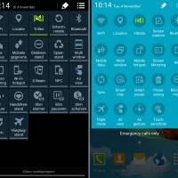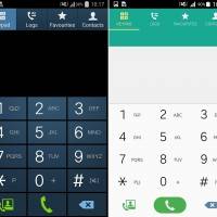
If you’ve owned a Samsung Galaxy S4 for some time now, chances are, you feel like getting a new phone by now or at least upgrading to the current flagship, the Galaxy S5. But if budget constraints have kept you from doing so, your problems may be temporarily solved for now. A side by side comparison of the difference between Android KitKat and Lollipop on the Galaxy S4 shows that it feels like you’re getting a new device because of all the major changes, not just design-wise but also how you interact with your smartphone.
While both the Galaxy S4 and S5 will be upgraded to Google’s newest major update, the effect is more pronounced on the previous flagship because the Lollipop has also brought the newer version of the TouchWiz UX which the owners of the Galaxy S5 have already been enjoying. Of course the most obvious change is to the design which is now adhering to the Material Design concept, which means it is now “bold, graphic, and intentional”. Everything is lighter, makes use of space and color and uses “meaningful and appropriate” motion.
Some processes like setting a wallpaper, choosing widgets for your home screen are much easier with Lollipop with the removal of several extra steps that KitKat has. The updated OS also makes liberal use of swiping through menus instead of the usual tapping, and this is very much evident in the settings menu. How you read and receive notifications is of course one of the major changes that Lollipop is bringing as well, with the L-type design and being able to choose what to do with them even on locked screen mode.
Of course, the Lollipop on the Galaxy S4 used in the video is not the final build, so there may still be some small changes when your device finally receives the update sometime early next year. This is probably the biggest update that Samsung has ever given to any of its major devices. You can check out the video below for the more detailed comparison between KitKat and Lollipop on the Galaxy S4.
VIA: SAM Mobile


It looks a heck of a lot like my Note 4’s interface. Sweet.
I am very disappointed after watching this review waiting for tests because design is even worse changed from black elegant on flashlight white
Black screen saves battery. I also think it´s more descrete + doesn´t “blind” the eye while in dark lighting.
The most important questions for me are
– is it really (that) faster, using less cpu or such
– is it more versatile in functions (no matter how clubsy it might be to use them)
Lollipop did a lot to reduce battery usage. While I’m still waiting for Lollipop myself, I’d be willing to bet they did enough to warrant the material design. I personally agree that a black screen saves battery. This is one of those will have to wait and see things. My understanding about the UI is that it is more fluid and feels ‘right’. There are a lot of things they could do to make things feel faster even if they aren’t, just by how things transition. There are a lot of new features on Lollipop to, for instance there is a better battery management system that I would say is more versatile than what we’re used to. Android 5.0 isn’t widespread yet, just limited soak test at the moment till it is sent over the air to the masses. At this point it is more of a wait and see thing.
Lollipop might have done a lot to reduce battery use but making everything white canceled out any of the gains.
This is totally bullshit.Im using s4 myself.The only reason samsung showing lollipop on s4 is because lollipop and kitkat on s5 is almost identical.Ultra ugly touchwiz smothered android lollipop.besides those blinding white doesnt look much classy to me
This is just more laziness. Changing things for the sole reason to exclaim update!”, whether it makes things better or not is bs. Why is there an extra step (pumping) to turn wifi and bt on and off? Changing things from black to cartoonish white and moving things around in the menus from where people are used to finding them just to say it is an update is totally laziness.
Will this work for Note2?
Where are the REAL improvements? Shuffling the menus around is just a nuisance, after you’ve had the kitkat and gotten used to that,
New animations??!! Who cares, I usually disable them.
A carrousel to find your widgets, instead of a page of icons!!
ONE click faster to change your desktop!!?? How often do you do that?
Most tests always just look at the how it looks never go into the small details, that matter to the users:
Has it improved battery time?
Can you store whatever you want on the external SD card? (NO review found this “improvement” in Kitkat, before people started complaining)
Can you have different audio messages for system and text messages?
Can you go to sleep by tapping the screen instead of that button on the right?
And there are probably many more, which we won’t find out, until someone installs it, and lets the others(who waited) know.
When do they start to improve the bad stuff and leave the good stuff in there, so the system gets better and better, instead of just changing everything, good or bad.
They should make an Android Wiki with user inputs of good and bad stuff and then use that for improvements.
Funnily enough I have had my s4 since they first came out and have no intention of getting rid of it, it’s such a great device and with nova launcher on it and all the bloatware removed by rooting it it works a charm and with the sd card fix I can shove what I want on the sd card
S4 upgrade to lolipop is a disaster.
please dont update…Kitkat is much better.
On lolipop my web browsing has been a nightmare. Some games just stop while you are are playing it and this happens repeatedly. You have to restart the phone and then you may be lucky if its temporarily solved.
hey i updated my samsung s4 from kitkat to lolipop 5.1 .now m facing various problems like battry drain etc.
plse don’t update before my phone was having standby of about 2 days now battry drains even m not using my phone charging time is also incresed to 6hrs nd drains in 6hr f@**ng update
now m going to downgrade it from customercare will it face othr problems plse anyone here to hlp me
BRING BACK OUR DARK MENUS U IMBICILS!! WHO DOES THAT SRSLY?!?
I agree totally. This new look is entirely ugly
Why difn’t they tell us this upgrade would be a kindergarten version? Its upgrade notice sounded like an essential upgrade. It is too late for me to go back considering the difficulties and risk. What a shame!
Is it just me or I can’t swipe through the tabs in Phone & Settings????
Improved Lollipop graphics? Really? Kit Kat’s black menus were cool. My phone looks like the kindergarten version with ugly colored paper colors. This mostly white keyboard color is ugly. The 2 screens you show above is a prime example. One on the left is classy. One on the right with ugly 2 tone blue is cheap looking. The icons on every screen are larger and blurry and less detailed. The messaging screens were cool before, now very ugly. The camera and clock widgets look like drawings. KitKat’s were more detailed. Congratulations on making classy screens look cheap.
I so agree! I love the black background! The with looks like a FRIGGIN iPhone! Black looked elite like the Galaxy stands for! At least give us an option….right?
yes i really agree this new update sucks and makes me very angry at Samsung!!! go back to the way that it was, everyone i know hates this new update and quite a few are thinking about switching, hope that they do something about this or they are going to loose many customers
I really don’t like the changes to my phone, mainly all the colour changes, I dont think it’s as clear any more, I don’t like the lighter background, and I really dislike the orange and green theme, have tried to change it but obviously I can’t. I’m really not happy.