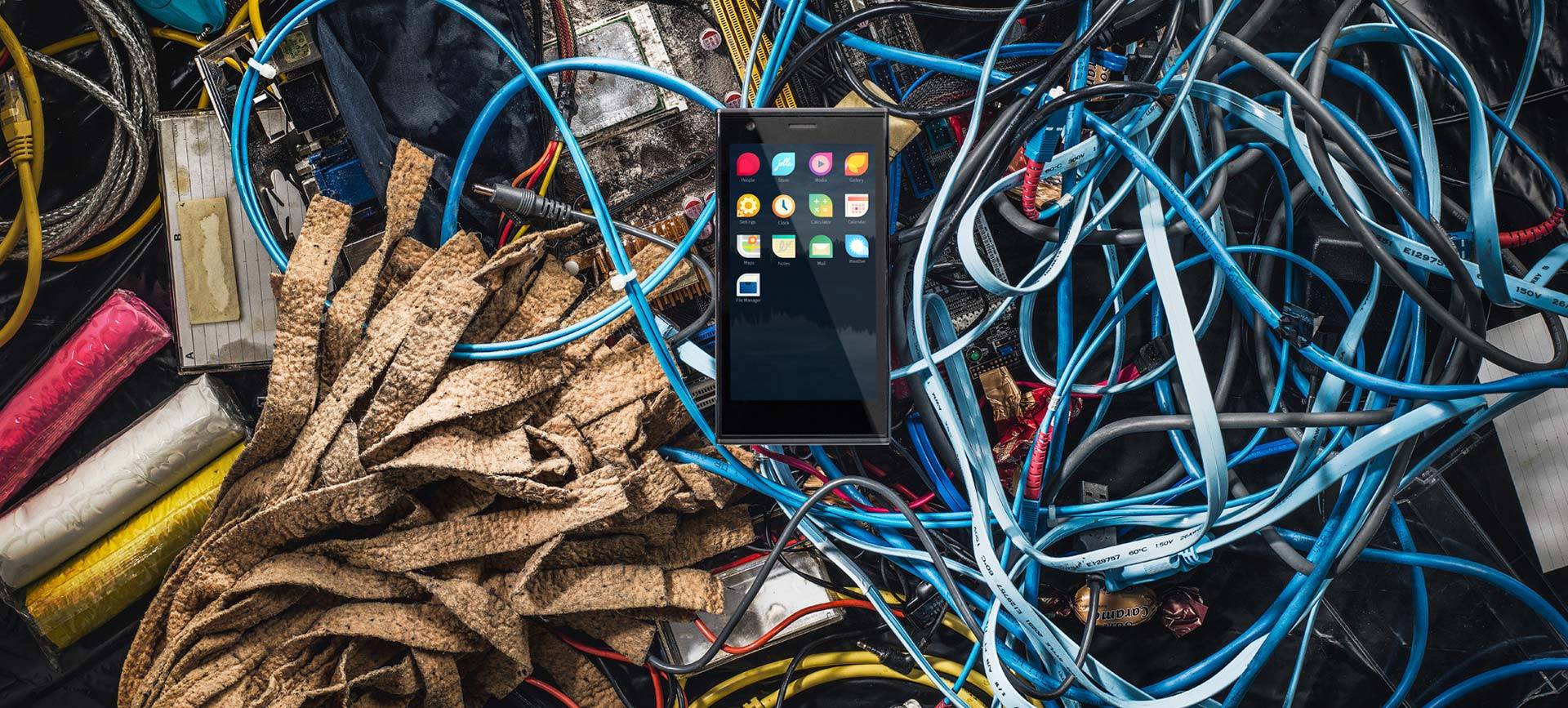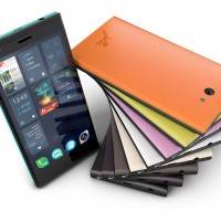
With a slogan such as “unlike”, you know that Jolla wants to set itself apart from others. Now that the smartphone has left the port, it’s time to wait and see if it will hit or miss the mark. But in the meantime, we can take a look at this Finnish company’s end product that, in all honesty, is a mixed bag of curiosity and disappointment.
The hardware of the first Jolla smartphone can be best described as mediocre. If one compares it to Android phones in the market, it would line up with mid-range devices. A 1.4 GHz dual-core Qualcomm processor runs the show, paired with 1 GB of RAM. External storage is capped at 16 GB but expandable with a microSD card. It has the usual support for different kinds of connectivity such as LTE, WiFi, Bluetooth 4.0, GPS, and others. It has an 8 megapixel rear camera with Auto Focus and an LED flash and a 2 megapixel front-facing camera. The 2100 mAh battery is promised to last 9 to 10 hours of use or 500 hours on standby. Fortunately, the battery is user-replaceable should one have a spare. The 4.5-inch IPS display, unfortunately, only has a 960×540 qHD resolution, which is a bit low even by iPhone 5s standards.
If the hardware has failed to impress, then the software and related features might, or at least arouse a bit of curiosity. The Jolla smartphone runs Sailfish OS, which is both an old and new mobile platform. Old, since it is ultimately based on one of Nokia‘s abandoned projects, and new because it has been changed to an extent that the traces are no long recognizable. Just like Android, it has its roots in Linux, but its flavor is probably closer to the kind of Linux you see on desktops, or at least on Nokia’s abandoned smartphones. As with any new operating system, one problem will be populating the market with apps, especially popular ones. Jolla has got you covered, somewhat ironically thanks to Android. Like BlackBerry OS 10, Jolla is able to run Android apps, perhaps more seamlessly than BlackBerry‘s implementation.
In terms of user interaction, Jolla builds on the gesture and swipe-based conventions found on its spiritual predecessor, the Nokia N9. The phone does not support hardware buttons on its face. Instead, the system relies on swiping from all screen edges to initiate certain actions. Swiping from the left or right edges lets users cycle between apps and screens. A slow swiping action from the sides lets you take a peek at notifications on the home screen, and then release to go back to the active screen. There is also a new kind of way to interact with menus that Jolla is calling Pulley Menus. Users can start swiping from the top or bottom edge to bring up a menu. As the menu unfolds, menu items get highlighted one after the other. If the desired menu item is highlighted, letting go of the menu, which springs it back up or down to the edge, is the same as choosing that item. Alternatively, one can always drag down the menu all the way down and use it as normal. The video below, which is Jolla’s launch ad, shows all these gestures in action.
As with any new or non-mainstream mobile platform, the question is whether it will gain enough users and traction to keep it afloat, in the face of very crowded two to four horse race. For now, that answer will have to wait as availability is quite limited. The Jolla smartphone is primarily launching in Finland and Europe with a price tag of 399 euros, or $542.


“399 euros” automatic fail… Unknown platform, weak hardware, poor screen, price higher than Nexus 5… FAIL, FAIL, FAIL…
Its price is definitely a concern here. You might just be right with your “ruthless” critique; therefore, it shouldn’t have been priced that high. But maybe if the new-found team/company manages to grow bigger, it might be able to compete with its competitors pricewise.
The price isn’t quite the best for the hardware….