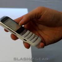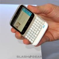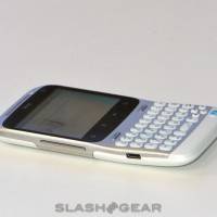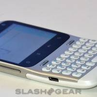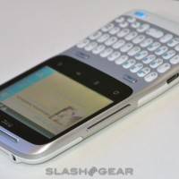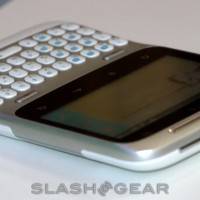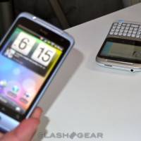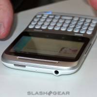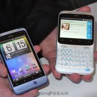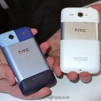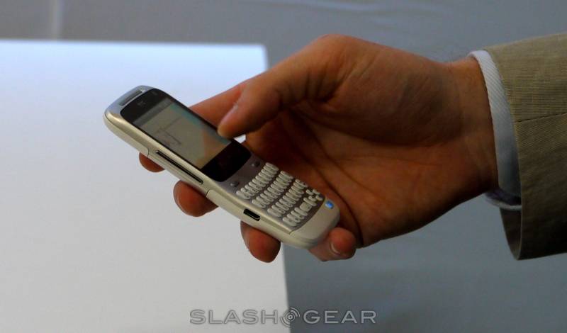
Essentially just a moment ago we revealed some rather intimate pics of the HTC ChaCha, under a glass case because they’re not floor-ready, only hardware ready – and we’re not entirely sure of that either. Now we’ve got a hands-on of both the HTC ChaCha and the HCS Salsa. You may notice that the title of this post only includes the HTC ChaCha – this is because we’re not nearly as enthusiastic about the HTC Salsa. That’s not to say that there’s no value in the Salsa, however, as you’re about to see, it’s just that the ChaCha has such a nice looking keyboard!
The first thing we noticed when placing the item in our hands was the lovely bend which will make working with the device utterly comfortable – or not full of the usual pain of typing 1,000 words a minute on a smartphone. The display is HVGA and has a relatively low resolution (480 x 320 pixels) but when you consider the size of the screen, it ends up looking fantastic. The metal cover over white and light blue buttons looks and feels very ergonomically designed, with everything in place for a one or two-handed typer.
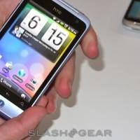
The Salsa is relatively blah. Looks essentially like every other phone that’s come out over the past year, especially the HTC Legend, for example, and feels sort of cheap in the hand. Also, unlike the ChaCha which has a full keyboard, the Salsa only has a single physical button on the front – the Facebook button. This looks rather odd in the context.
[vms b776e3143e8a1a057788]
Both phones are not running the software they’re going to end up with. What we’ve seen here is essentially a screenshot displayed on the screen, this becoming obvious when we accidentally bump the image while filming the hands-on. Have a look above at the video, and below at some additional images:


