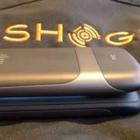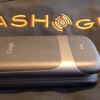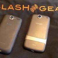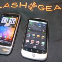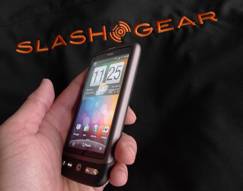
Let’s cut to the chase: the HTC Desire is seriously desirable. In effect a Google Nexus One with HTC’s slick Sense UI slapped on top, and the last-gen trackball replaced with a nice, modern optical joystick, we grabbed some hands-on time with the Desire straight after the HTC press conference finished.
It’s a slim device with a gentle curve at the bottom – not quite the traditional HTC chin but not the anti-chin of the Nexus One – and the whole thing feels expensive and solid in the hand. As far as we know HTC have used the same 3.7-inch AMOLED touchscreen, and the quality is still fantastic; Sense widgets look great, the the 1GHz Snapdragon processor has no problem whipping through homescreen panes or clicking into the mildly-addictive “helicopter view”.
Of course, because you get Sense you also get the new Friend Stream feed, which pulls Facebook, Twitter and Flickr updates from the Contacts app and into a single pane. HTC had prepopulated it with their own content, so we’ll have to wait until our demo unit arrives to figure out how well it works; still, you can respond to and comment on items in the Friend Stream directly. We’d like to see HTC add in support for more social networks, as Motorola have promised to do with MOTOBLUR.
In short, though, this is a seriously appealing Android smartphone and a worthy HTC flagship. The addition of Sense makes a real visual difference – and based on our previous experience, a usability one too – and we’re really excited about getting review time with it. Until then, check out the hands-on gallery and video demo below!
HTC Desire hands-on video demo:


