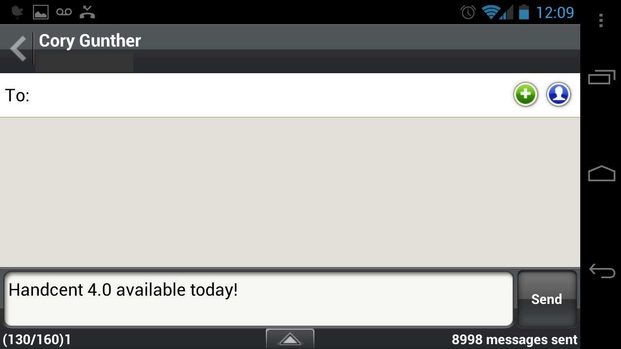
For those that love to send hundreds of text messages per hour I have good news regarding one of the most popular 3rd party text and picture message applications for Android. The popular SMS/MMS app Handcent, downloaded over 10 million times has just be updated today in the Play Store to version 4.0 and has tons of new features and a shiny new user interface.
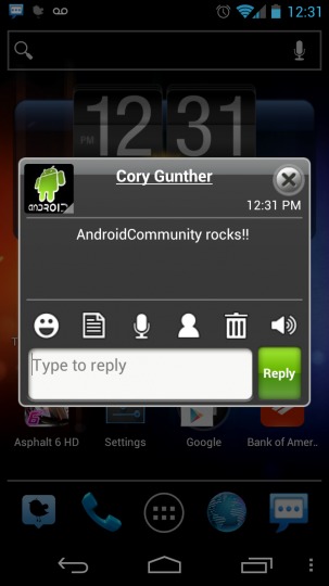
Many users probably just use the stock Android text message client but I’ve been a fan of Handcent for well over a year. Offering more customization than one would ever need and even quick popup notifications where you can easily reply to a text from the popup, then it closes and you continue exactly where you were.

The update to version 4.0 released today has a host of new features, improved UI and design, and support for even more devices. They now officially support Android 4.0 Ice Cream Sandwich, and have fixed some problems for the Galaxy S II and others. My Galaxy Nexus 4.6″ screen was having issues with the popup not being centered but this update has fixed all of that.
The what’s new tab sadly mentions a bunch of gibberish for the iPhone, even in the Google Play Store but most of the updates are geared for Android. They’ve added on-screen controls and back buttons for those using Ice Cream Sandwich, and the user interface has tons of grey colors and a much improved interface. Everything seems polished and it looks great. The new popup look will take some getting used to, but I think I can handle it.
The update also brings universal free text messaging to all Handcent users. Send SMS messages on their network instead of using your text limit from your carrier. And soon they’ll offer cross platform SMS/MMS messages on Android and iPhone for free too. If you’ve been using Handcent for your texting needs get the new app available now. If you’ve never tried it, I’d have to say it’s at least worth checking out once. It has so much customization that some might get overwhelmed, but once you set it up it’s truly awesome. With over 10 million downloads they must be doing something right.


looks hiddeous
The UI might not be the best but it’s extremely customizable. Once you get it all set up it’s way better than stock
Agreed…. stock just won’t work for me, I like having each conversation in different colors like alternating blue and green, so I know instantly what someone else typed and what I typed when reading back through long conversations, and nothing else comes close to handle what Handcent can do!
green reminds me of iOS so I have blue and grey.. haha
what about screenshots like how go sms has
GOSMS is my preferred SMS app. The Popup ui is damn near identical to the above (Well element placement wise it is).
I recommend GoSMS with this Skin to anyone interested: “Go SMS Theme Ice Cream minimal by KXNT
it’s truly awesome
Does it text overseas with no charge?