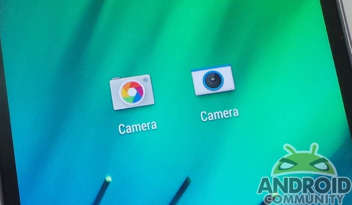
With the new Google Camera app, we gain a feature that’s become handy on the HTC One (M8). Lens Blur, or UFocus on the new One, gives us the chance to blur everything surrounding our focal point, creating a silhouette of sorts. Which is better, though — the dual-camera UFocus, or Google’s own Lens Blur? We go head-to-head to find out.
Lens Blur
Lens Blur has advantages because it’s available on more devices — pretty much anything running KitKat. Google was able to take their app and add some algorithmic goodness to create a very SLR experience for mobile photography. Without the chance to rely on specific hardware, Google uses the app to identify and gauge depth of field. It’s a pretty handy trick for devices that otherwise wouldn’t have the feature, but is it better than UFocus?
UFocus
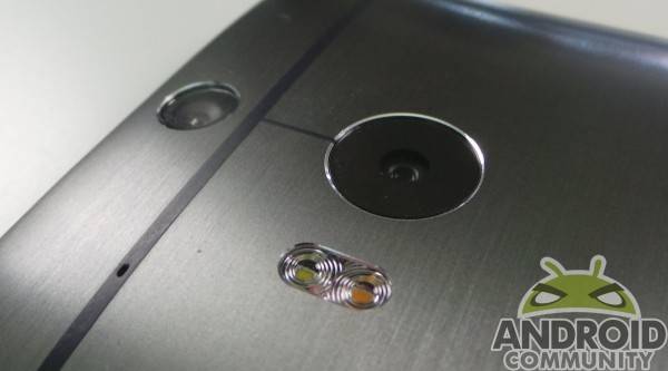
Where Google relies on their app, UFocus leans on hardware. Left to the HTC One (M8)’s dual camera setup, UFocus has something Google’s app can’t rely on — solid hardware. The second camera on the One is there specifically to do what Google’s app attempts to do — gauge depth of field. With dedicated hardware, UFocus can reliably count on the photo to be accurately (or at least as accurately as a mobile device can) gauged for depth, focal points, and other necessary info for editing.
A mixed experience
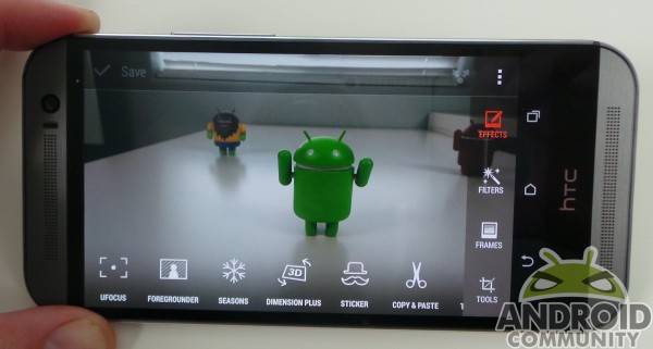
UFocus is an editing feature, so adding the blurred effect is done after you snap the picture. All you really have to do in the moment is snap a picture, and you’re on your way. The Google Camera app doesn’t have that luxury, as the blurring has to be done when you take a picture.
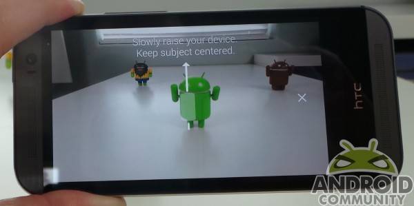
With Google’s Camera app, you must first choose the Lens Blur effect, then choose a focal point. Once you do that, and snap a picture, you drag the camera upward in an arc, keeping the subject in the same place on your screen the entire time. Your effect depends entirely on how well you drag the device upward, and how steadily you keep the subject in focus.
Samples
We’ll let the samples below speak for themselves. We’ve tagged each with an explanation of what was done, as we purposefully tried to trick both UFocus and the Camera app into screwing up. As you can see, it took a steady hand with Lens Blur before it could be compared to UFocus in terms of blurring. The faster we got with Lens Blur, the worse the blurring was, which was expected. The color sensitivity was also notable between the two. We will mention that with respect to equity, we tested both features with the HTC One (M8).
Conclusion
Google’s Camera App is great because it’s available for a multitude of devices. This effect would not be on as many devices as it is without the app, so that’s commendable. The only issue comes in real-world use, where the effect may be clumsy to take advantage of. With extreme care, it’s possible to get results equal to (or maybe better than) UFocus.
Depending on where you actually take the photo — or what setting you’re in — it may be difficult to actually drag the camera upward effectively. As we see in the samples above, not being diligent about the focus when dragging up screws things up. It’s also an effect done in the moment, so you’re not really going to have the chance to snap a quick pic using Lens Blur — it all has to be posed or stationary stuff you’re snapping pics of. If you move too quick, Lens Blur will tell you that you messed up, but that puts you back at square one.
If you have the HTC One (M8), or want one, UFocus is the winner here. The effect is just as good as Google’s, and it’s done after the fact, creating a lot more scenarios we can image it to be used in. If you grab a quick shot of something fun — or embarrassing — you can add dramatic effect to make it memorable (or more embarrassing).
UFocus also saves both the edited pic and the original, so you can snap away and edit after the fact, and not fear losing a pic that is good enough without the effect. Google’s feature is nice, but UFocus and the dual camera setup on the HTC One (M8) just can’t be toppled, here.











“UFocus is an editing feature, so adding the blurred effect is done after you snap the picture. All you really have to do in the moment is snap a picture, and you’re on your way. The Google Camera app doesn’t have that luxury, as the blurring has to be done when you take a picture.”
Untrue. Go to a Google Camera blur pic in your camera gallery and you can click the lens icon and adjust the blur amount. It’s not permanent either, so you can still go back and change it. Also, and I didn’t realize this initially, you can also change the area of focus by tapping different spots on the pic when you’re in the blur edit mode. Again, this is nondestructive.
What he means is that you have to use Lens Blur when you take the photo and stage the shot. If you just take a normal picture youre SOL.
UFocus can be applied later on if you decide you want it.
What I didn’t like about Google’s lens blur is the minuscule file size and the low quality picture you get in the end.