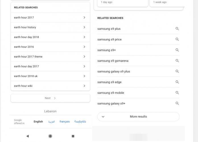
When you’re using your mobile device to search for something on Google and you can’t find it in the first page, sometimes you wish all the results will just be in one page (but not necessarily infinite scrolling). You just might get your wish pretty soon as it looks like the search giant is testing out another one of its gazillion ideas that they keep AB testing to selected users. This time around they’re looking at putting a “load more” search results page instead of the paginated one that we have right now.
The server-side test shows a different results page than what the rest of the world has right now. If you’re one of the users that they’re using as digital guinea pigs, instead of seeing the button for next (which brings you to the next page of the search results), you’ll see a more results at the bottom of the page and tapping on it will load the results from the next page but right there on the same page. Just keep scrolling down or up if you want to go back to something you may have missed.
This is called “load more” if you’re familiar with user experience or UX terminology. The current one we have is called pagination. It’s also different than the “infinite scroll” which can be annoying because the next pages are loaded automatically and you don’t have control to stop and load at will. Based on screenshots we’ve seen, this seems like a good idea for those who want to scroll up and down and not wait for the next page to load.
As always, this is a server-side test so we can’t force our Google search app to get this feature. If you’re one of the lucky ones, what do you think about this possible new UX?


