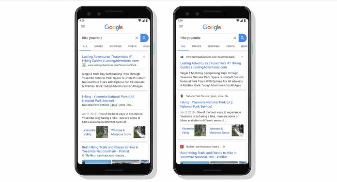
When you use Google Search a lot, probably the most important thing for you is to get results as fast as you can and to get them in a way that doesn’t require extra work for your eyes or your brain. Google has been making it easier for us to get the information we’re looking for, by adding images and videos to the results and even giving us quick answers in a box. The latest improvement they’re making to the mobile version of Search is a visual refresh.
The main new thing with this update to Google Search for mobile is that the website branding is front and center. Making it more visible will help users further understand where the information in the results page is coming from. In this age of fake news, seeing upfront where the results are coming from should be able to help users filter the reliable information from the fake ones. Well, if they know what fake or agenda sites to avoid that is.
Your results page will now show the name of the website and its icon on top of the results card. Site owners will of course be able to choose their preferred icons or the favicon for the organic listings. If the thing you’re searching for is a product or service and there are useful ads that Google can show, there is a “bolded” ad label at the top of the card so there will be no confusion.
Later on, Google says they will be able to add more action buttons and helpful previews in the search results cards because of this new visual refresh of the search app. They’ve previously added some useful things like buying movie tickets or listening to podcast episodes, right from the search result cards themselves.
The visual refresh has started rolling out to mobile users so check on your Google app if it has arrived for you already.


