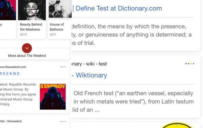
What your Google mobile search looks like doesn’t necessarily have any effect on what you see on the results page (well, generally). But of course having an improved or better looking app is almost always welcome. Google seems to be rolling out a new look for their Android search app, but since there is no official announcement yet, it may either be just an initial rollout or just a beta test that can disappear if the response is not positive.
The changes aren’t really major, but it what you get are results with a softer, rounder edge. And in the upper right corner of each of the results, you get four colored little dots that corresponds to the four colors of the Google Logo and its newest devices, the Pixel smartphones. So basically, it just matches what it looks like in the Pixel and Pixel XL, but this time replicated in whatever Android device you have.
While it doesn’t really have any bearing on the search results, there may be a bit of a change for some. The change in the font size and also the spacing between lines may reduce the number of web results on the page. It may become 3 instead of 4 and for those who rely on being on the first page of the search results, this may become a problem.
Some users have reported seeing the changes on their Android devices, but none so far for iOS users. So we’re not really sure if this is a permanent change already or if Google is sending out feelers to selected users.
VIA: SlashGear


