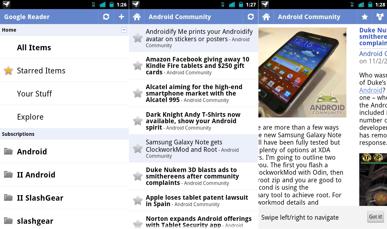
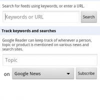
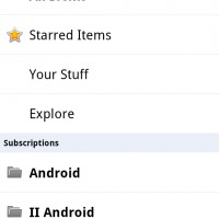
We saw a few leaked screenshots of what was claimed to be an updated Google Reader application last night that turned out to be either fake, or a bit old. Today Google has officially pushed the brand new Google Reader v1.1.1 to the Android Market complete with a new user interface and widgets that resemble 4.0 Ice Cream Sandwich, and plenty of other navigation and usage improvements. While the actual interface hasn’t changed a lot, they have added swipe navigation and it works extremely well.
Along with Google Reader, Google Docs also received a very similar update that has a slightly more noticeable change to the user interface — one that closely resembles Google +. Both Google apps have received a slight makeover giving them a closer appearance to that of Android 4.0 Ice Cream Sandwich and we have the slide to navigate through stories or documents both, as well as enhanced share options that are closer to the web versions. Then the widgets, the new widgets look great and I’m loving my Google Reader unread ticker although I still feel it moves a bit fast. We’ve got a few screenshots below for you guys to see what your missing if you’re not yet a Google Reader user.
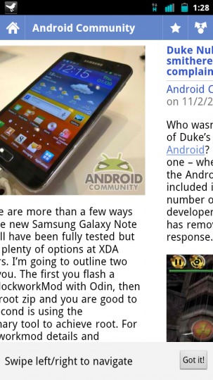 Like mentioned above, the slide to navigate feature is now present in Reader v1.1.1 and it works great. It marks the stories as read and the entire swipe gesture is simple, smooth, and very fast. You get an annoying notification below (shown in the picture) but you can quickly hide that as the feature is one you wont be forgetting any time soon. A few comments on the market said stories aren’t getting checked as “read” when swiping, but everything works great for me here and so far I’m loving the new improvements.
You’ll quickly notice all of the sharing and following type options that were present before have been removed, as those features are now offered by Google+. Instead we have the familiar share icon in the top right just like recently updated Android apps and the market have featured for some time.
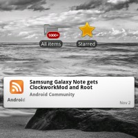
The widget improvements are also quite nice and work great. I’ve thrown a few on my homescreen and took a screenshot for everyone to see them in action. Like mentioned above, the new unread ticker works great but still is a bit fast and I wouldn’t mind being able to manually set the refresh time myself.
You can see all of the screenshots in the gallery below for a better idea of what to expect with the new Google Reader v1.1.1 that was just updated today. Feel free to head to the market and try both of these new apps (links below). Interesting enough, Google Docs received plenty of changes yet the change-log remains untouched in the market, but I’m sure you can see the differences yourself if you’re a daily user.





I don’t see anything different about Google Docs. Are you sure they just released a new version? Maybe you just haven’t used Google Docs on Android in a while?