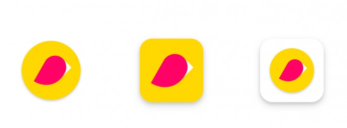
Because the Google Play Store is available on a variety of devices like smartphones, tablets, and Chromebooks, it doesn’t always follow the same format for some reason. But now it looks like Google will be imposing a new design that will have a more consistent look across the devices, at least when it comes to the icon design. They have announced to developers that they will have to conform to the new design that is more of a “uniformed” square with rounded corners.
This should have been something they should have done a long time ago for a cleaner and more consistent look, but at least they’re finally doing it. The icon assets will still be the same size at 512 x 512 but they will not be allowed to have transparent backgrounds. Rounded corners and drop shadows will be applied, with the corner radius being 20% of the icon size.
However, these will only be applied for Android and Chrome OS but not for other form factors like TV, Wear, and Auto. It will also not affect the APK launcher icons for Android. As for the schedule, developers will be able to upload starting early April. By May, the new icons uploaded should be confirmed as meeting the new specifications and rejected if they don’t apply it.
And if by June 24 the app still doesn’t have a new icon, they will be automatically converted to “legacy mode” which means your existing icon will be placed into a white squircle. Google promises to update developers on the steps over the next few months but you should probably start working on it already.
SOURCE: Google


