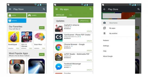
This is a developing story, but it seems that Google has updated the Play Store app, and there are very obvious changes to this new iteration of our favorite app marketplace. The app has changed aesthetics closer to what we might expect from a movement towards Google’s Android L launch (soon, we hope). And there are some tweaks within the app itself that would be good to look at.
Officially, this new rollout is build number 5.0.31, an update from the most recent 4.9.13. And first up, we get a new Play Store Icon. Below is a history of icons, starting from the Android Market period. But the last one is the most recent one, giving a more “cleaned up” version of the 4.9.13 iteration. Personally, I like the cleaner, sleeker look to it.
![]()
Also, the update boasts more Material Design – which is, if you’ve been living under a rock these past few months – is the catch phrase for the cleaner, minimalist, and simplistic design theme taken to by the still un-launched Android L. Also, you will notice that the “What’s New” section for every app has been moved up – a much needed tweak, we would say. What took you so long, Google?

There should be a couple more new stuff in the update, allow us to explore more. This has just rolled out, so a number of you might need to wait a bit for the rollout to get to you. If you’re interested in downloading the APK installer for yourself, try this link here.
DOWNLOAD: mediafire
VIA: Android Police


