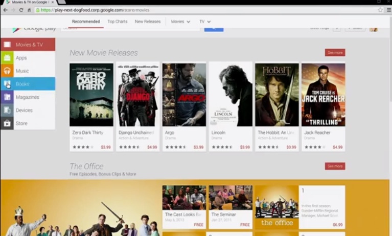
Google has been busy lately. From updating Chrome Browser for Android, a new Gmail this afternoon, and the entirely new Play Store a couple of months back. Today we’re getting our first look at the all-new redesigned Play Store for the web, and apparently this new look will be coming extremely soon to a web browser near you.
At Google I/O we learned the web version of Google’s Play Store would soon be getting overhauled to closely resemble their new Play Store on all Android devices, and today we’re getting our first glance. Obviously the entire Google Now card-style layout is popular with Google, and won’t be slowing down anytime soon.
In fact, this card style layout from Google Now and countless other apps will probably be implemented deep into Android 4.3 Jelly Bean, which we’re still waiting to learn more about. We have a feeling this new web store will roll out along with the newest OS, but can’t confirm either of those at the moment.

According to Droid-Life the images above are the new Web Google Play Store which should be coming “in the next few weeks.” As we can see, it closely resembles the version we’re use to using now, and the card style is looking good. It appears they still need to clean it up a bit and make things a bit more uniform and such, but overall it isn’t bad.
It’s basically the newest Google Play Store v4 tablet design moving over to the web, in a way, although the “devices” area will probably look a bit different as they intent to sell all those vanilla GALAXY S 4 and HTC One’s. What do you guys think of the new look?


Looks good, about time the web version got a redesign
“It appears they still need to clean it up a bit and make things a bit more uniform and such, but overall it isn’t bad.”
they need to stop fucking playing with it
Hopefully they’ll get around to add wishlist functionality to the web store this time. And maybe gifting apps to other users as well?