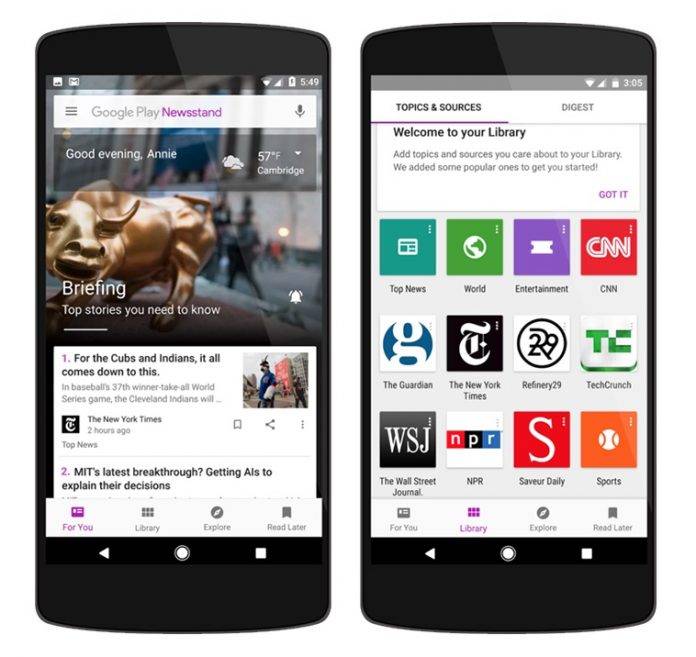
If your impression of the Google Play Newsstand is that it is somewhere you can only buy magazines or subscribe to newspapers but it is not something that is personalized or important to your digital life, Google wants you to reconsider with their updated design and user interface. The three big improvements are: a more personalized reader, improved support for multimedia, and update for the web as well. Hopefully, this is enough for people to actually give the app and service another try.
Google Play Newsstand has actually a pretty rich catalog when it comes to news items and articles (because, duh, Google) and now they’re using machine learning to bring you more relevant and personalized content, based on the things that you care about so you don’t need to sift through those that you don’t want to read about. When you open the app, the first section you see is the briefing where you get a mix of the major headlines, local news, and your personalized items. Then below that, you have a stream of stories based on the topics you like and the sources you added in your preferences.
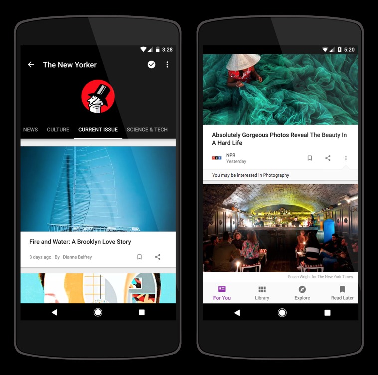
The improved support for multi-media content now means you get to see autoplay videos, easy podcasts controls, and also high-resolution, full-bleed images. This means your timeline is now more “alive” and more visually stimulating but at the same time, you can also choose the Data Saver mode in case you want to save up on your data and bandwidth. This improvement is courtesy of the AMP support that Google recently launched.

Lastly, the update not only applies to the mobile app version, but Google Play Newsstand now also has a web app. All your preferences, sources, and other information stored in your account can be accessed there as well. For the mobile app, go and update to the latest version to enjoy these new features.
SOURCE: Google


