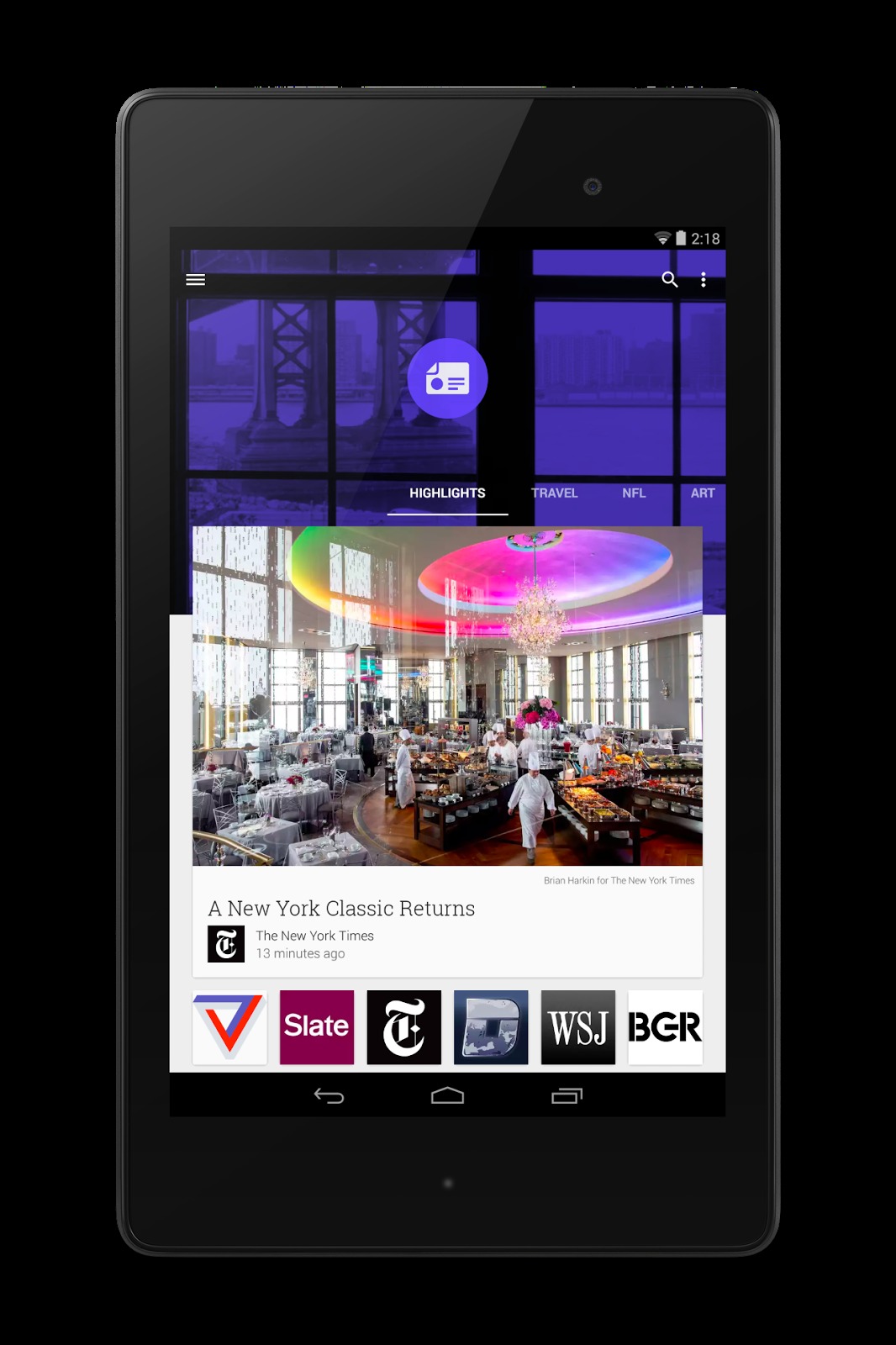
If you’re a fan of curated news apps that look just like a magazine as you flip through all the relevant news just like you would a magazine, then the new look of Google Play Newsstand just might convince you to use it. The app, built-in for some devices and downloadable for others, has just updated with a new look and improved services to appeal to users to make it (one of) their news reader of choice.
If you’re used to using Flipboard or Zite or Feedly to get your daily feed of news from your favorite sites, it should suit you to check out what Google has done with its Newsstand. It has adapted the material design that will eventually herald the upcoming Android L. But more than just the design, even the reading experience is enhanced with the update to the app. You don’t need to zoom in and out anymore just to be able to read an article when you’re on your mobile device. You can now see a list of articles from sites that you’ve marked and they’re already resized, both text and pictures to fit the gadget you’re using.
The material design has also made the app look better, with contextual headers, bigger images and smoother transitions from one story to another. Aside from subscribing to certain news sites, you can also now add even more cards for those topics that interest you, from something as general as vegetarian recipes, to something more obscure like Brony (look it up!). You can swipe left and right to look at topics, then swipe up and down to look at the news items on the topic you chose. You can also choose to use mini-cards to just browse through headlines before clicking on something that you want to look at in-depth.
There are over 2,000 free and paid publications on the app, but not all countries have access to the paid and full-length ones. Google Play Newsstand can be found in more than 40 countries and if you don’t have it built-in to your device, you can download it from the Google Play Store.
SOURCE: Android


