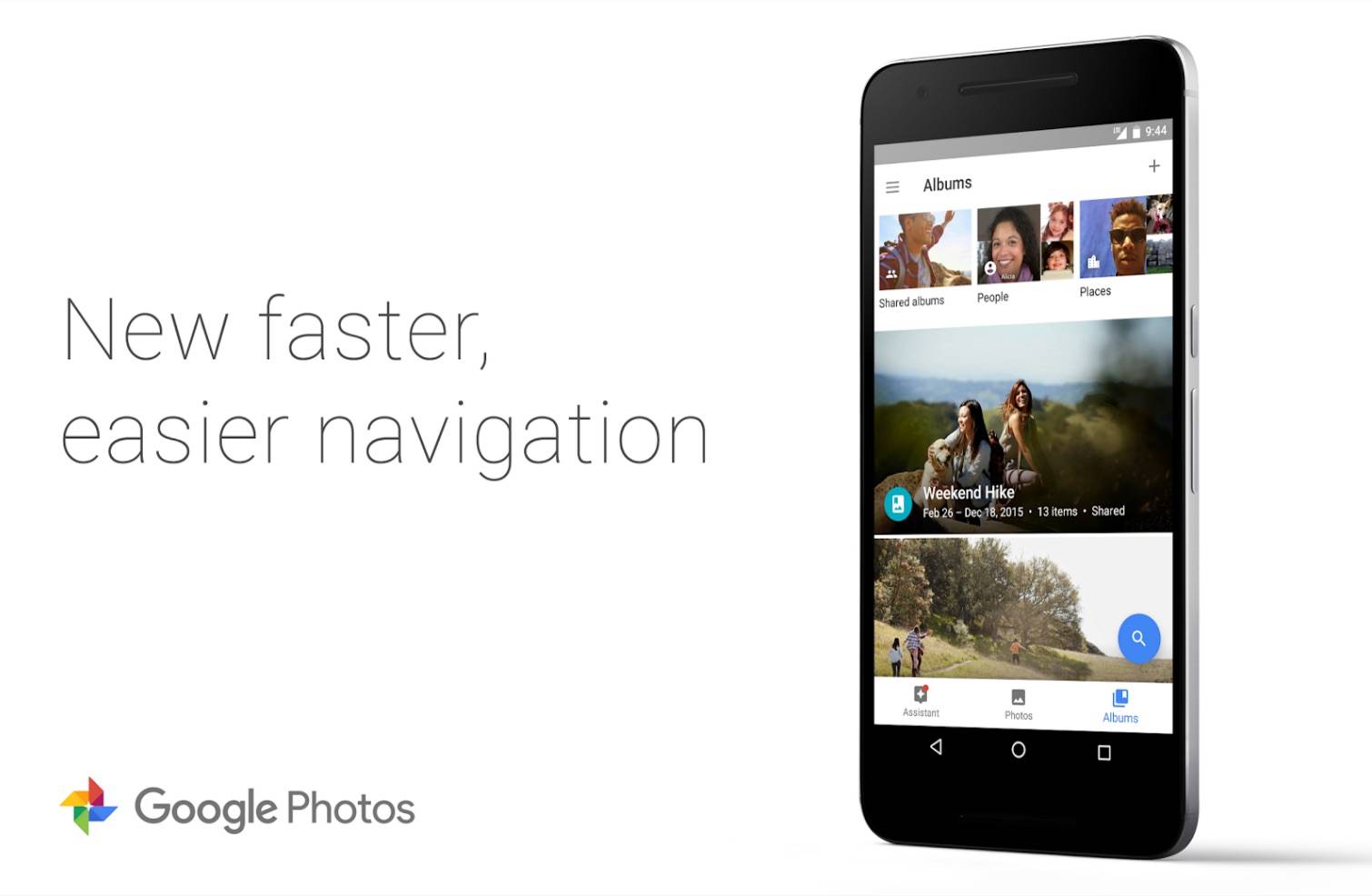
Google Photos has become an indispensable app for those who have a lot of photos but are too busy or lazy to organize them properly, especially now that Picasa is saying goodbye. And while most people were pretty happy with how it looked before, there’s always room for improvement. The mobile app now has undergone a navigation overhaul to make it more user-friendly, while the web version has also implemented some changes when it comes to editing your photos.
Once you’ve updated your Google Photos mobile app, it might take you a few seconds to readjust your eyes to its new look. There is now a bar at the bottom of the interface where you can see the Assistant, Photos, and Albums. Yes, what was formerly known as Collections is now just Albums, apparently based on user feedback. There is also now a carousel at the top when you click on Albums so it’s easier to browse through people, places, things, movies, collages, etc.
Meanwhile, there are also some changes when it comes to editing photos on the web version of the app. You will now be able to browse through your other photos while you’re on editing mode. Before, you had to close the photo before you can look through the others when you were editing. But now you just click on the next arrow to move on. Your edits will of course automatically save but you can undo them easily by choosing the “Revert to Original” mode. You also now have an aspect ratio selector when cropping so you can choose Original, Square, 16:9, or 4:3.
For the Google Photos mobile app, you can now update it to see the navigation UI changes. While with the web version, the changes are available already so feel free to explore photos.google.com.
SOURCE: + Google Photos (1), (2)


