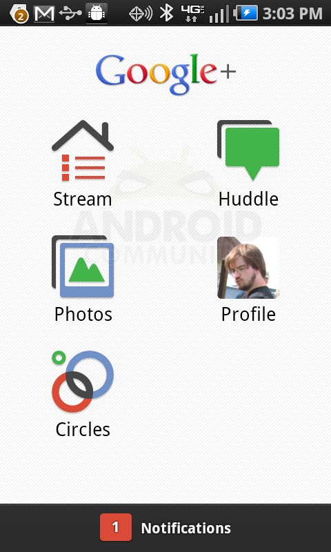
What we’ve got going here is the official Google+ app, made public yesterday along with Beta invites to the program, us here on Android Community amongst the lucky to have been granted access to the program because we just love sharing everything we know about Android with the whole community. Know what I’m saying? Therefor let’s have a look: an app which opens up to a screen of five shortcuts to functionality beyond our wildest social dreams. This screen has the ability to be pulled up or down, this leading us to believe that there’s much more to come in the near future. Let’s dive in!
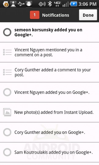
We’re going to go through each of the options here starting with Notifications: this is exactly what it sounds like and exactly what it is on Facebook, that being notes about how people are interacting with your Google+ presence, be it a tag, a note, a comment, a connection, or a share. It’s here that you’ll be able to see what other people are doing with you, everywhere else where you’ll be able to start working with them. The following is a look and review at the app version of this ecosystem, we’ll be looking at the web-based version very soon. You can access a video version of this tour and review at the end of this post. Check it out!
Stream
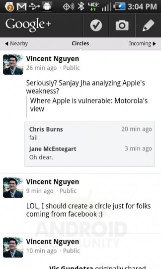
Stream is where you’re able to see three sets of updates from you and your Circles: first is one that’s just titled Circles. This one shows you everything from every Circle you’ve created (we’ll be getting into Circles a just a few paragraphs.) Then there’s a list called Incoming – this being things that were shared specifically with you, finally a list called Nearby. This shows you updates from people in your Circles (or outside of your Circles, should you choose,) that are near your same physical location. If this wont generate some buzz about how Google is literally connecting people in real life, I don’t know what will!
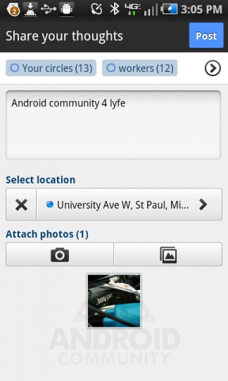
This is also one of the places you’ll be able to see your update window. Here you’ll be able to add your location, your status, a photo, a photo from a gallery, and you’ll be able to do all of it sharing only to the people you want to share to – Circle or individuals, all of it simple.
Photos
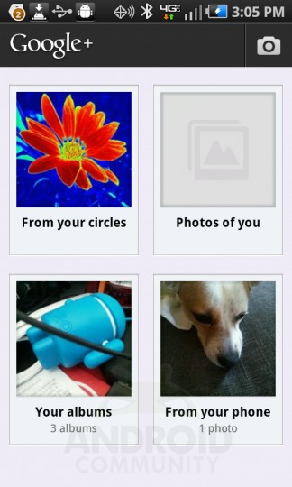
This set of photos includes those submitted by people in your circles, those you’ve uploaded to your cloud, the photos you’ve got sitting on your mobile device right that moment, and the photos that’ve been tagged with you specifically. From here you’ve also got quick access to your Instant Upload options, that being your ability to upload every photo you take with your mobile device to your Google account “instantly.” You can also retroactively add all the photos you’ve ever taken to the cloud here as well. Data costs be damned!
Circles
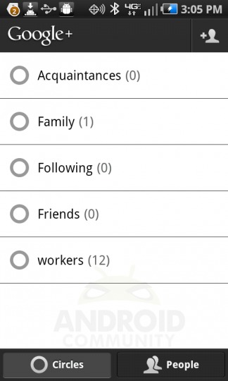
Circles is the place where everything happens. It’s here where you sort everyone you know into groups that can then be shared to. Whenever you make an update to your status, upload a photo, start up a Huddle chat, anything, you can select a Circle, multiple Circles, or just individual people outside of Circles to be included in your share. This is an opt-in sort of situation as opposed to Facebook’s very opt-out blocking of people from your streams and shares. Circles looks decent here, and much more fantastical when you’re checking it out from your desktop computer in your web browser. Same functionality though, round em up!
Huddle
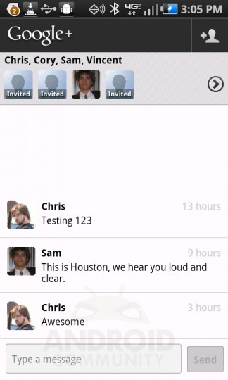
Huddle is an extremely simple chat program that works directly with Circles. It’s here that you’re able to set up a chartroom for people that you want to be a part of the chartroom, that being people from certain Circles or just individually added people from your contacts. Where in the future we expect this to be integrated in one way or another with the now just web-based Hangouts, more of which you can see in the following post:
Android Community 101: Google+, Circles, Huddle, Sparks, Hangouts, and Mobile Functionality
When asked about how Huddle will work with web-based and desktop-based options of the future, Google had this to say directly to us:
We’re in Field Trial now, so this is just the beginning. It’s really a group SMS messaging app right now.
Just the beginning – remember that! We’re certainly hoping for an advanced version of chat closer to what, for example, GroupMe has going for it – Hangouts and Huddle meeting would be the coolness.
Profile
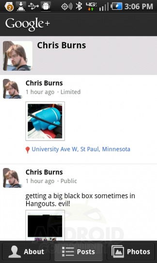
Your profile shortcut here will lead you to a selection of three screens, one of which will be your Profile. This Google Profile is one that you may have had now for several months or years, as Google has had such a location for you to add your information for quite a while. From here you’re able to add the places you’ve lived, the places you’re employed or have been employed, and a simple status, not to mention your school names which can include whatever you consider a school at all – my most recent entry is The Streets.
You’ll also be able to see your photos. These photos are ones that YOU’VE added, be it to your cloud, to your posts, wherever, just so long as they were submitted to your Google+ account in some way or another. Then the main section (or at least the one that pops up first when you open Profile, is your Posts. These are the shares you’ve made throughout your Google+ history, each of them hitting your Streams as well. Here is the only place you’ll be able to see JUST your stream.
Video Tour
[vms c0218351dc5c0c846410]
Wrap-Up
What Google has presented here is the first step in a much larger journey that’ll make Google even MORE part of our everyday lives than they already are. Sharing is only one piece of this puzzle, the rest of it’s made up of working more efficiently with your co-workers via chat elements, sharing content with yourself via your own cloud and your web-based Google+, and working with apps that bring this all together in the desktop world – or perhaps we’ll just be sticking with the internet since Google’s pressing rather hard on the Chrome OS button as of late? We’ll see!
To get this application, you’ve only to head to the Android Market and find Google+. At the moment you’ll not be able to access any part of the app (or the Huddle app shortcut which comes with the download) unless you’ve got a beta invite – and if you’ve got one, you’ll know! You may as well download the app anyway as in the very near future the invitations will be open to a much wider audience and you’ll want to dive in head first – jam on over to the Android Market now!


Aside from some great social functionality the posts, pics and videos i’ve seen looks like Google hit one out of the park visually – the user experience looks well thought out, the UI beautiful.
Now, where’s my invite? 🙂
Big disappointment for me on the mobile front is the hefty (8+ megs) footprint of the Android app – and the fact that it can’t be transferred to the SD card.
Unless and until G+ replaces Facebook for me (and there’s a long way to go on that), I can’t afford the room. I want to love it — but it’s already cheesed me off.
when anyine can invite again please send on to me at cghunt@gmail.com, otherwise ill have to start using Bing… please save me from the horror! 😉