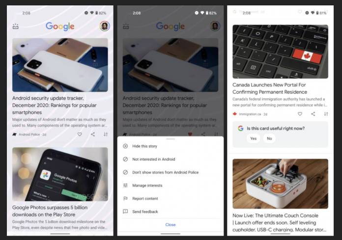
The Google Discover feed oftentimes sees slight tweaks and changes as Google experiments with how it looks like, basic functionalities, etc. It looks like they’re testing another look for it but this time it’s slightly major. They seem to be testing out a feed that will not have the signature card interface that we’re used to. We’re also getting a share button that’s more visible than the current one we have. However, there’s no word yet when or if we’re getting a wider release for this.
According to Android Police, this seems to be a limited test for now as only a few users are seeing this change on their Discover feed. One of the main differences you’ll immediately see is that the usual card interface has been tweaked and you actually see your mobile device’s wallpaper behind the titles and excerpts. This means if you have a bit of a busy background then your Discover feed may look a bit messy.
Another main difference is that the search bar and the Weather forecast have also been removed from the home screen. If you’re using a Pixel smartphone, then that’s okay since you see the weather on your home screen through the At a Glance widget and you also get the search bar at the bottom of the launcher by default. But for those using an Integrated Discover feed, it can be quite annoying not have those two elements handy.
You’ll also now get a share button outright under the headline and excerpt of an article, right beside the heart button. Currently, you could actually share articles of course but the share button was hidden in the three-button overflow menu. If this update rolls out, it will remove an extra step as sharing is much more convenient. However, there may also be the tendency to just share something without reading it.
The new Discover look seems to be a server side update so you’ll have to wait for it to get to you. Hopefully, the testing rolls out to a wider audience so we can determine if we like this new feed or not.


