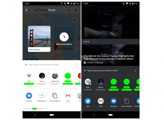
When you’re sharing an image, document, or something from an app you’re currently using, the Android’s built-in share sheet isn’t the user-friendliest. Aside from the fact that it’s slow and clunky, the user interface itself isn’t that great. Google has been promising a redesign for some time now and we finally may be looking at what it will look like with the new share menu that Google Maps is rolling out.
The delay in loading the Android share sheet causes a lot of problems, with mis-sent shares among other things. Just last month, Android’s engineering VP Dave Burke promised that they’re working on something that is “much faster and nice to use”. While we still haven’t seen an official roll-out of this share menu, we may be getting a preview with Google Maps’ new share carousel.
Aesthetically, we’re now seeing rounded corners in the share sheet, which is of course one of the things that Material Theme brings. On top of the share sheet, you’ll see the card which notes what place you’re sharing from as well as an icon to add more places if you prefer. Under that, you now see a “To” field where you can manually enter a contact’s name, phone number, or email.
Below the to field, you’ll see a list of contacts and if you swipe to the right, you’ll get a “more” list. Under the contacts, you’ll see the list of apps that you can share the place with and swiping right will also lead you to more apps. Then you’ll see at the bottom the account that you’re sharing from, which is important if you’re using multiple Google accounts on your phone.
This new share sheet is seen on Google Maps’ version 10.6.1. If you’re not seeing the update yet, just wait for it to roll out to you as it seems to be a server-side update.
VIA: 9 to the 5 Google


