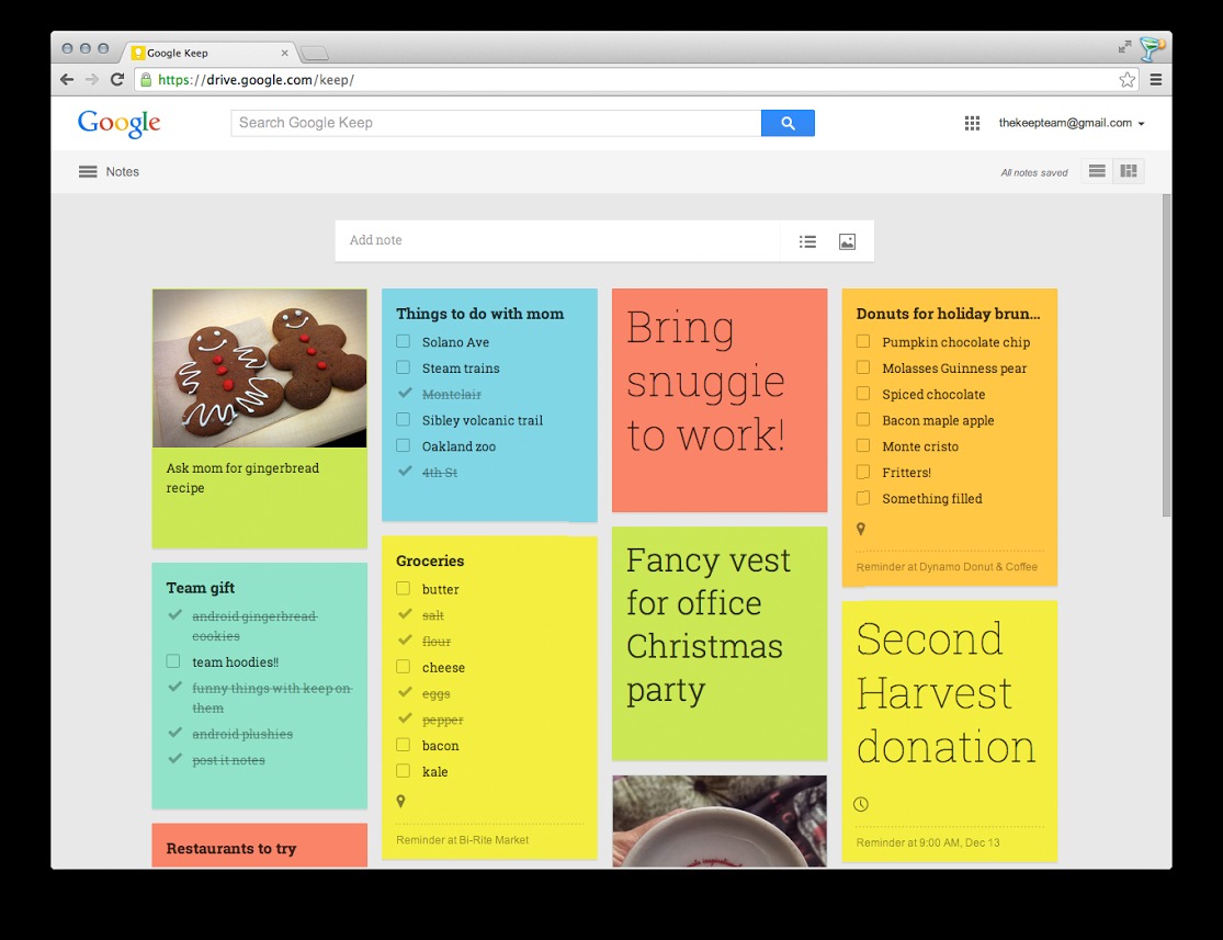
Just in time to help you keep notes on your holiday activities, Google has just announced a rather significant update to Google Keep. While these changes are limited to the web-based version, they do bring it close to the features and behaviors of its Android counterpart.
In a digital note-taking world dominated by Evernote, or Springpad if you lean that way, Google Keep is a rather strange product. It does, however, have its own fans who prefer simple and straightforward functionality that more closely resembles the iconic Post-it more than full-fledged notebooks. This latest update further improves the service by bridging that gap between the web interface and the Android app.
Just like on Android, Google Keep in web browsers will now sport the side navigation drawer, accessible via the “hamburger” icon on the top left. This will let users easily switch between showing all notes and archived notes or reminders. It also features an improved search to make it easier to find the exact note you want. List items can now also be reordered according to your preferences. And finally, Google Keep has also been updated to match the visual appearance of the Android app with full color options and custom fonts.
You can immediately view these changes from any web browser by simply visiting the Google Keep website. Of course you can also access it via the Android app from Google Play Store or the Chrome browser app.
Download: Google Keep on Google Play Store, Chrome Web Store
Thanks Jonathon!


I use Keep as a sort of “front end” to Evernote. I just find it easier to add stuff to Keep. Keep is uncomplicated, like a table top. Evernote is a deep file drawer. Once captured, information stays on my Keep for a while before I bury it in Evernote, with the exception of a bulleted list of To Dos. I like it.