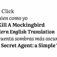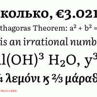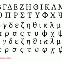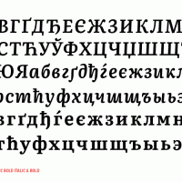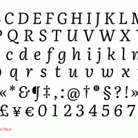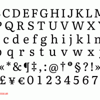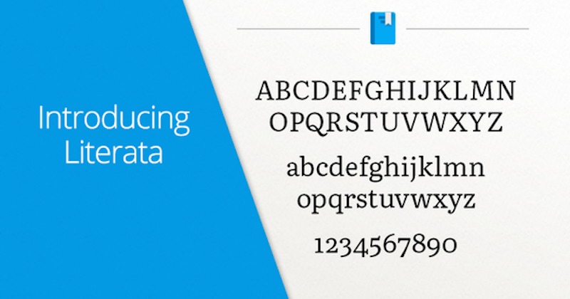
If you’re a regular reader on Google Play Books, you’d be happy to know that there is a new font you could use. The new font called Literata is said to be ideal for longer reads on all devices so whether you’re reading on your smartphone or tablet, your eyes won’t get tired because the new book typeface was custom-made just for Google.
It was the TypeTogether design team who worked on the font made especially for the Google Play Books app. Designers Veronika Burian and José Scaglione led the design team that was tapped by the tech giant last year to match the redesign of the mobile app.
The goal of this new typeface is to make a better reading experience with a font that is easy to read, understand, and would look really good in hi-res. This brings a visual identity for the native ebook reading app by Google–making it very much different from the other ebook apps.
You know how much font/typeface can affect the reading so Google thought of improving it so more people would be attracted to use the reading app. Books with nice typography attract people and this is somehow the case in ebooks or digital displays. With the addition of Literata, the new font can provide a new perspective or a new digital reading experience.
Google understands that book design matters and the typeface used could make the book or document more interesting. The TypeTogether font was inspired by the old-style Roman and Scotch forms and nwo comes in many versions.
SOURCE: Google Play


