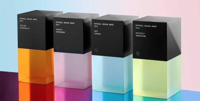
If you’re an app developer or designer, one of the bragging-rights types of awards that you may aspire for is the yearly Google Material Design Awards. While it doesn’t bring any cash prize, you do get a cool-looking trophy and a dedicated page for awardees on the Google Play Store, which is a plus point for discoverability (among the millions of apps available there). This year, they have chosen to honor four apps for various reasons: Ruff for Theming, Reflectly for Innovation, Scripts for Experience, and Trip.com for Universality.
Google says that Ruff’s brand identity shines in their note-taking app, as it is consistent in its color, typography, and shape. Some people might find it too minimalistic or simple but it is highly functional and uses Material Components, particularly in the bottom sheet and the backdrop. It also has a blue floating action button that makes it easy on the eyes and on your hand. You can also customize the type size and a light, dark, or black theme.
For the innovation part, journaling app Reflectly is the app that caught Google’s eye. The app helps users deal with stress and anxiety through daily journaling prompts and the way they execute this is a well-crafted user experience, with its motion choreography, elevation adjustments, and state changes. They also allow users to customise components, typography, shape, etc based on the principles of Material Design.
Scripts got the award based on Experience since it uses your phone’s touchscreen capabilities to help you learn new writing systems. It lets you experience a step-by-step drawing interaction with instructions which will help immensely when learning languages like Russian, Japanese, Korean, etc. It even gives you haptic feedback if you are doing well. And despite having diverse writing systems, the app is still able to keep its typography consistent.
Lastly, the Trip.com app got recognised for its excellent universality. While there are a lot of travel-booking apps out there, this particular one is simple and understandable enough to not overwhelm or intimidate users and at the same time caters to its diverse user base with imagery and illustrations that reflect that. It is also able to have a consistent layout and typographic sale despite having 19 supported languages.


