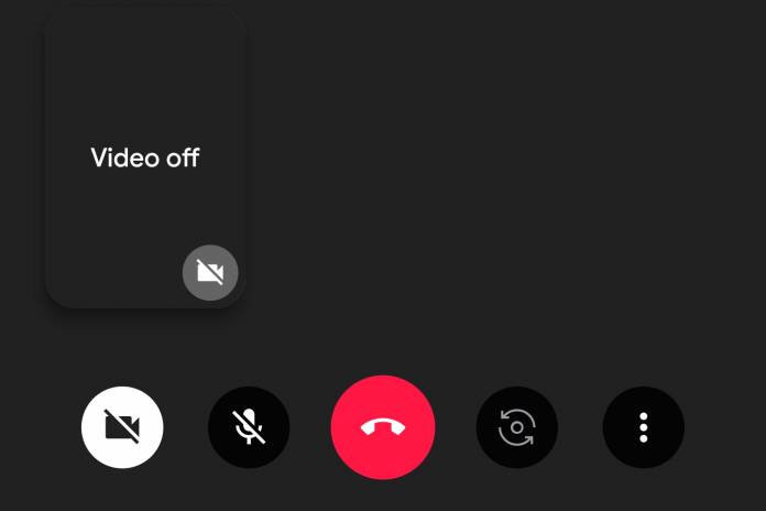
If you’re using a phone with a tall display, having the menu or navigation keys on the side or on top is highly inconvenient, especially when you can’t use both hands. Google has been bringing a bottom bar to some of its apps, which makes it easier to use the app when you just have one hand to use your phone. The latest app that may be getting a bottom bar UI is Google Duo. This means when you’re on a call, it will still be easy to reach the important buttons.
Android Police says they’re not sure if this is still a beta test or a server-side update but some users are seeing their Google Duo with a new interface when you’re on a call. Previously, most of the action buttons are on the left side of the screen. And if you have a long phone, then you’ll have to do some finger stretching. But now those buttons have been placed on a bottom bar. The camera off, mute, and switch cam buttons are alongside the red call button.
There is now also an additional overflow menu, also at the bottom bar UI. There seems to be just one option under that which is the low light mode toggle but they will probably be adding more soon since they put it under a menu. For now, though, all the important buttons can be found in the bottom bar, just at your reach when you’re on a phone call and you need to switch or toggle something on or off.
Some users who are already on version 67 of Google Duo are seeing this change in their app while some are still with the old UI. So it may be that it’s still in a beta testing mode or Google has to be the one to switch on the update from their end.
In any case, it still wouldn’t hurt to update to the latest version of Google Duo and see if you get the bottom bar UI already. If not, then just keep stretching to get to those buttons.


