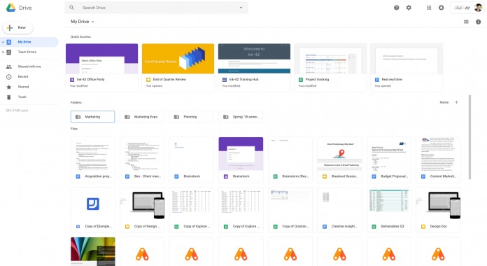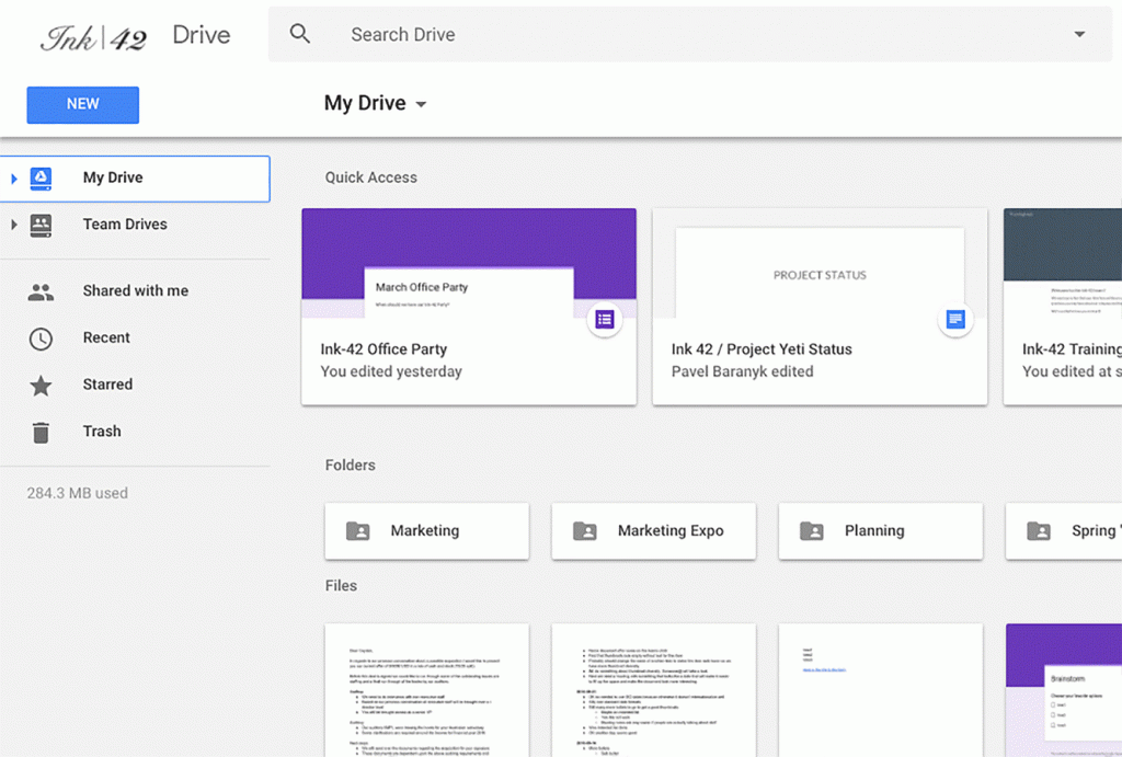
Updates don’t always bring new features to your favorite apps. Sometimes it just makes them look better (hopefully). The latest update for the Google Drive web version brings an improved UI to align it with the custom material design that Google continues to rollout to all their products, both on mobile and the web. The new interface is to give Drive users a more “responsive and efficient experience” and also so it feels more cohesive with other G Suite products.
Some of the cosmetic changes include putting the Google Drive logo on the top left of the screen and if you’re using a custom company logo, then it will now be found on the right. You can now find your settings icon as well as the Help Center icon in line with the search bar for a more intuitive access. The page background is also now white instead of the previous gray to give it a cleaner look. The font used for the headers has been changed and you also now get a new “New” button.
There are no new features or functions in this update, but having a new look and UI does give users the feeling that they’re using a familiar but improved app. It should also match the feel of the newly redesigned Gmail app, although the Drive changes aren’t that “radical”.
The update for Google Drive is already gradually rolling out but it should take two weeks to completely reach all users. The changes affect all G Suite Editions.

SOURCE: Google


