Google surprised everybody when they unveiled their brand new identity today. Don’t worry, yes, they’re still the same old search engine you’ve depended upon like it was air. What they’ve done is evolved their logo, icons, and basically their whole visual identity in order to meet the needs of users and their various screens, formats, sizes, etc. Google believes that the new logo and brand identity “express the same simplicity and delight they expect” when they visit the homepage, as they use the search page and other Google products on their various devices and surfaces.
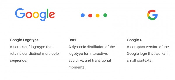
Google gathered all the designers from across the company, including the Creative Labs and Material Design teams, to come up with this new visual identity which could be applied easily to their whole gamut of products. First of all, the Google Logotype now uses a sans serif but retains the colors for which they’re known for: blue, green, yellow, red. For the “interactive, assistive and transitional moments”, you know have a dot animation. And now, for the small contexts, meaning smartphone screens, wearables. etc, you now have the Google G, which is basically a condensed version of the main logo.

This visual rebranding will not just affect desktop, but over the next few weeks, we’ll see it applied to Android devices, Android TV, Google apps, and all throughout their mobile and non-mobile universe. Already, we can see the new icons for G+, Google Maps, Google News, Google Translate, with more to come soon. Also, we’re seeing that the Google logo has been adjusted for users with lower bandwidth. The old logo had 14,000 bytes, but now the new one is just 305 bytes.

We’ll see more Google rebranding efforts pop up in various apps and devices. But more than just the look and feel of the logo, this is eventually going to be about improved experiences of users across various devices. Let’s wait and see if it will bring obvious performance changes as well.


