Regardless of how you feel about the second phase of the Material Design that Google has rolled out in its apps and hardware, you have to accept that it’s here and it’s probably here to stay. While you can always choose to use other apps if you find the redesign not to your liking, those apps made by Google (and some that aren’t) will adjust to this eventually. One of Google’s built-in apps, Contacts now gets its own redesign and new features with version 3.13.
Basically, Material Design 2 or MD2 is a more minimalist and less colorful approach to the original Material Design that Google released a few years back. Its emphasis is more on white space and the colorful backgrounds of the first generation are practically gone. The Google Sans font is also much more noticeable especially in a lot of the headings part.
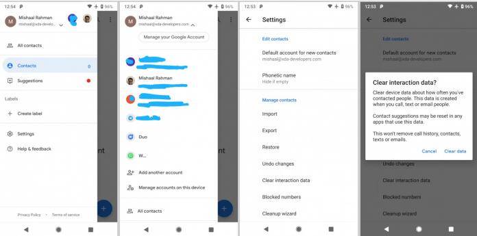
So of course as expected, we see a lot of those things in version 3.13 of Google Contacts, which is available for Android devices running on version 5.0 of the operating system and above. From a design perspective, there were a lot of changes especially in the sidebar. You won’t see the colorful image anymore on the account header. Instead, you just get a white background which will make your profile pic stand out more.
You will also now be able to clear your interaction data with your contact, in case you don’t want to see it. You can clear from your device how many times you’ve contacted a person, including calls, texts, emails. However if you do clear it, it might reset suggestions for your contacts. The good news is that it won’t really wipe your call history, contacts, texts ,emails, etc.
You can update your Google Contacts app to version 3.13 through the Google Play Store. It will work for Android devices running on version 5.0 and above.
VIA: XDA Developers


