If you’re like us, you live and die by your Google Calendar. From keeping appointments humming along to scheduling calls, Calendar can be a godsend — if you use it. Some don’t, and that has a lot to do with Google’s version being clunky and hard to manage. Rather than use it as your back end solution for your calendar needs, Google has brought new features to the forefront designed to keep you on track and focussed.
One of the more poignant new features is Calendar’s integration with Maps, in which an event location will pinch the autofill service from Maps. If you start typing a place, Calendar will autofill the location, just like Maps. Via the Gmail blog, Google notes that this feature is taken straight from Maps, leading us to believe that it will also know your saved locations and search history. If you’re always having lunch meetings at a local restaurant, it will learn your search query and begin autofilling for you.
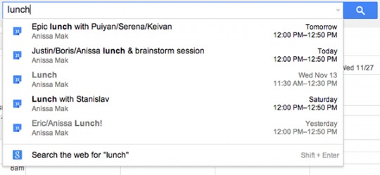
Taking a page from Gmail, Calendar improved its search capabilities, too. Inside of Calendar, users can now type ingot he search bar to find keywords and phrases. If you know you’ve got tickets to a show, but don’t remember which day it is, you can start typing the name of the show or location, and Google will tale care of the rest.

Finally, group invitations are changing a touch, tracking group activity. If you invite a group to an event, and one person leaves the group, Calendar will update the invitee list, giving you a better idea of RSVPs and such. We hope this is a solution for those pesky Google+ event invitations we turn down, only to see a ton of notifications afterward.
Calendar desperately needs a once-over from Google, and these are good starts. We love using Calendar, as it syncs really well across platforms and incorporates well with third-party calendars. The next phase, we hope, is a revamped UI. The Android version of Google’s Calendar is just plain hideous.


Calendar on Android is hideous? I think it’s great, it shows you all the information you need, has 4 different views, it’s easy to add and edit events, the widget is simple, translucent where empty and grabs the colors from appointments.
I just grabbed Cal by Any.DO today and it seems like a big step backwards, it’s only real stylistic benefit being that it randomly grabs pictures to make your background in the app if your calendar doesn’t fill it. But why open the calendar app if you don’t want the calendar to fill the screen? And it doesn’t have an agenda view (that I saw), except in the widget.
I really don’t understand where design complaints come from sometimes. Maybe I’m just too happy when something works well.
I seconded. Cal is nothing more than visual appealing, and having only the agenda view makes time management harder than ever.