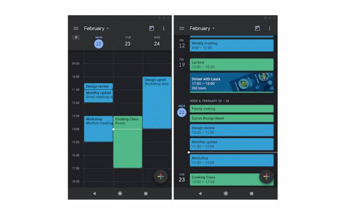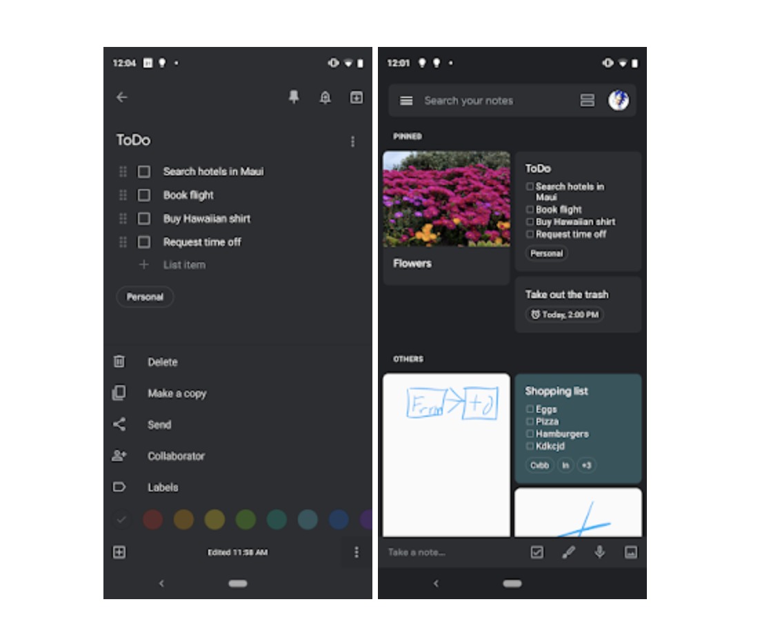
Things seem to be getting darker and darker every day. No, we’re not talking about the current political landscape but rather about the apps on our phone, particularly those from Google. Every day we get reports and official announcements of dark modes cropping up on various apps. It was spotted earlier this week for Google Keep and now we have the official word from Google that it is indeed rolling out. Google Calendar users will also now be getting this dark mode option with the latest update.
If you’ve been waiting for your calendar to lose all that white space that Google has been touting all these years, the latest update to the app should take care of all that. Once enabled, the primary white background for Schedule, Day, 3-Day, Week, and Month views will now be replaced by a dark gray color. A lighter gray shade will appear for the status and app bar and the navigation sections while the other colors have been darkened as well.
We’ve seen screenshots of what the dark mode for Google Keep will look like and now the update has officially been announced even if it began rolling out last week already. The previously white background will become a dark shade of grey while the other colored notes will become a shade darker as well.

The dark mode can be enabled by going to the settings of both apps. With Calendar, you need to go to the General section to see the themes option while on Keep, you’ll see an enable dark mode part when you go directly to the settings. They are both turned off by default so you will have to manually enable them.
Calendar’s dark mode will be available for those running Nougat and higher while with Keep, devices running on Lollipop and higher will have this option. If you’re already running Android Q, you can enable the system-wide dark mode and both Calendar and Keep will follow.


