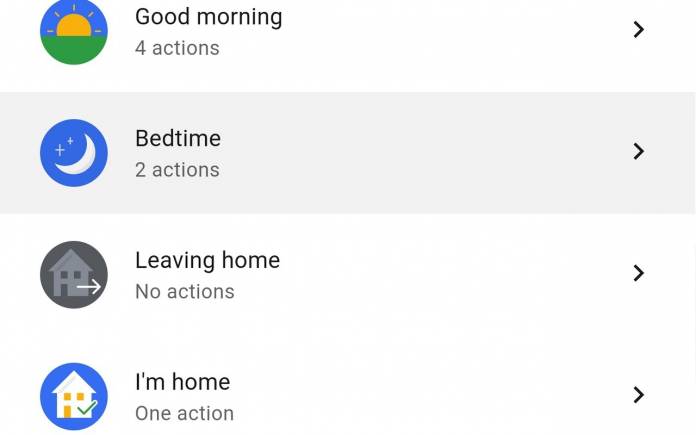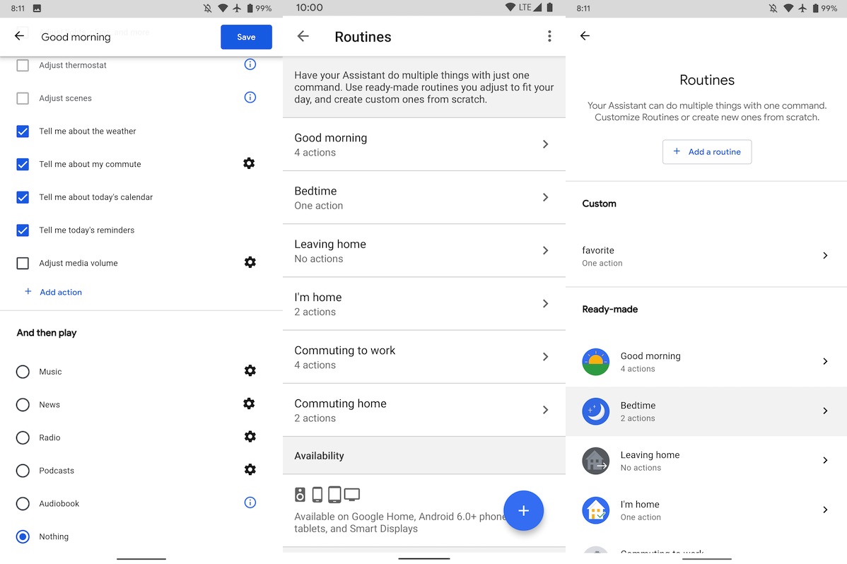
The Google Assistant app is getting a bit of a redesign. The Routines page now implements the Material Theme. Some users may already see the changes on their app so feel free to check yourselves if the updates are available. The Routines interface has been enhanced with a more user-friendly design. Check out Routines under the Assistant Settings > Assistant tab and see for yourself. You will see some changes in the text style looking more simplified now. This is common with other Material Theme redesigns, making the total look of an app or screen easier on the eyes.
When you click ‘Add a routine’, you will then be taken to a ‘New routine’ page. It is basically the same but it has its own page with a cleaner look. The background is white now which matches most Google apps and services. The design is less cluttered because the line separators have been removed.
You will see Custom Routines first on the homepage. You will also notice fun icons for the Ready-made macros that are commonly used by people from Good morning to Bedtime to Leaving home, I’m home, Commuting to work, and Commuting home.
Assistant Routines will soon replace the Home/Away status as Google moves away from ‘Works with Nest’. They will also be available on more devices like smart displays, Google Home, and even smartphones and tablets running at least Android 6.0.

The updated Assistant Routines will be available on most devices but for now, it’s being released as a server-side update. Google will be rolling out the improvements soon but for now, some beta users can take advantage of the changes.


